This week, I am sharing another nursery e-design reveal! But this time, the design was created around a fairly atypical theme—bees! This client came from a long family history of beekeepers, so we wanted to find a way to reflect this in a sophisticated way. The result was one of my favorite e-designs to date!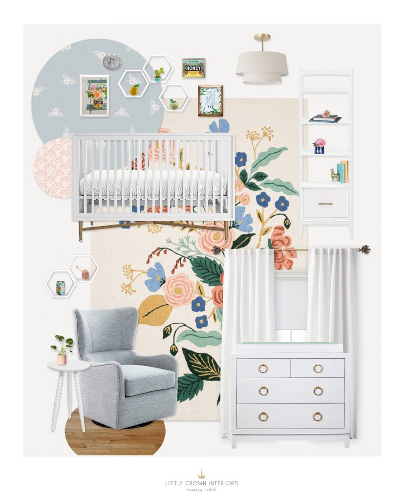
Crib | Dresser | Glider | Floral Rug | Bee Wallpaper | White Curtains | Hexagon Shelves | Side Table | Bookshelf | Pendant
I began by selecting the color palette for the space which was inspired by a vintage honey label belonging to my client. We framed the label to be used within a bee-themed gallery wall located above the crib. Honeycomb shelves filled with soft items add a whimsical play on the bee theme.
The focal piece of this design is the bee wallpaper! I was able to find this print in a less predictable colorway of light blue and white. We definitely didn’t want to get stuck with the typical black and yellow bee color scheme. The sophisticated palette sets the stage for a more elegant play on the theme. Because the room was on the smaller side, we opted to use the wallpaper only on an accent wall so the pattern wouldn’t overwhelm the space.
To continue to open up the space and to promote a light and bright feel, we chose to use all white furniture. I also find that using a white base allows the color selection to really pop. To unite the entire color scheme, I found this floral patterned rug—the perfect choice for bees and bee lovers alike.
This design is another great example of how to suggest a theme in a fun and whimsical way without going overboard. Subtle nods through thoughtfully chosen decor and textiles add just the right touch. All in all, it’s one bee-autiful space!
*This post contains affiliate links, but don’t worry, I only link products that I would 100% recommend!*
[et_bloom_inline optin_id=optin_10]
