I’ve been so excited to share this nursery design reveal with you! This year has been crazy for all of us, and because we had to slow down on installations and photoshoots, my publishing schedule definitely fell behind. I completed this nursery several months ago, and I’m so excited to share it with you!
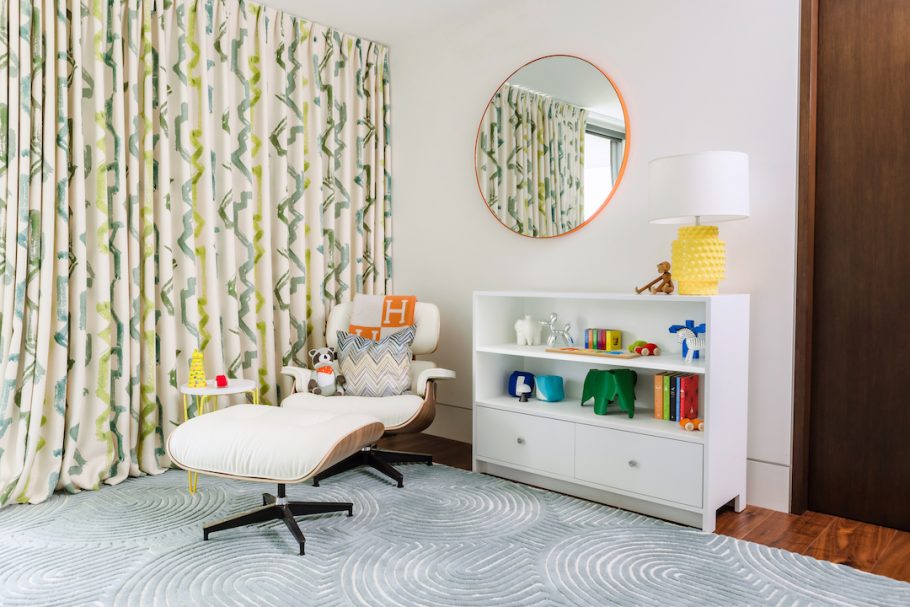
This nursery space was previously a guest room. My client was ready to remove every single thing from it, except for the gorgeous hand-painted curtains she already had. The whole wall is a large window, so it was great that she already had full blackout curtains (that were fabulous!).
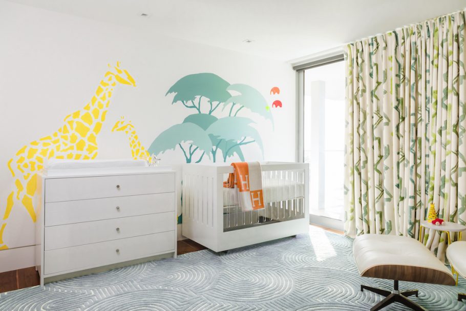
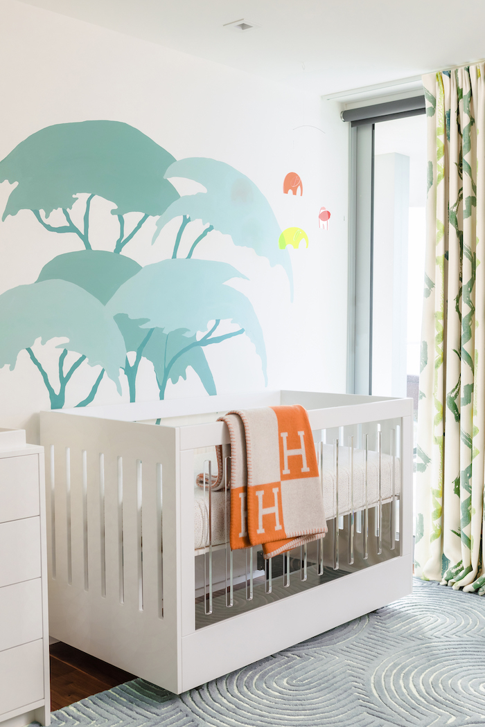
We drew the main color palette from the curtains and decided to use blues and greens accented with pops of other colors to make the room fun and energetic.
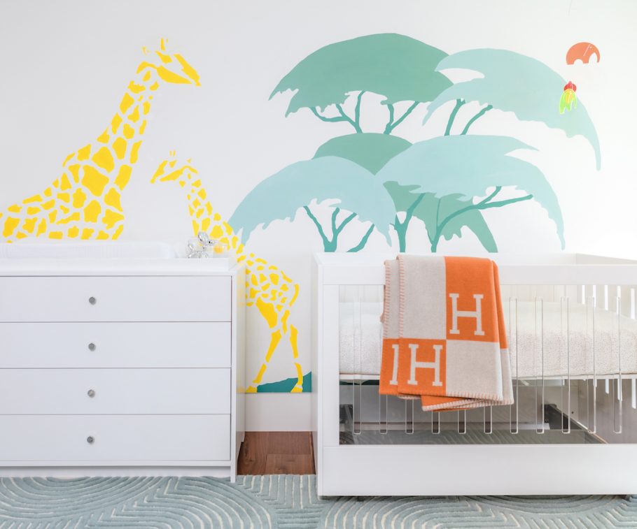
We had a big blank wall behind the crib and the dresser to do something fun. We considered wallpaper, but because of the big patterned curtains, we didn’t want to add anything that would compete. So instead, we worked with muralist Allyson Wong and created a custom safari wall mural.
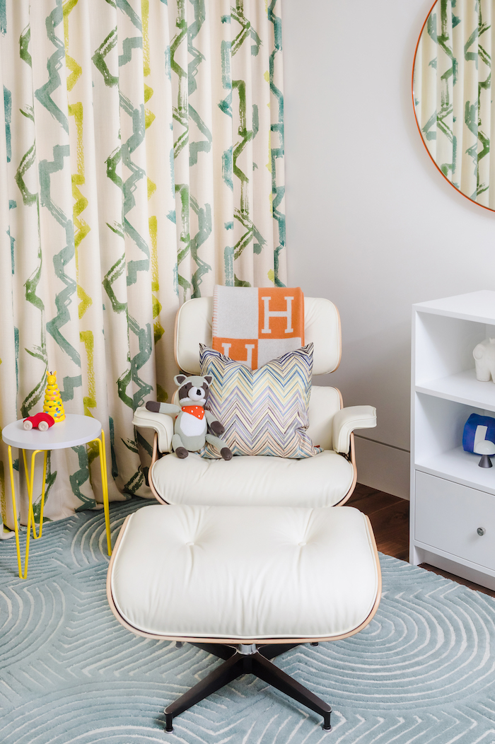
Instead of a traditional glider, my client really wanted to use an Eames lounge chair in the nursery. She had one for her first child and loved it, so we got another one for the new nursery. We got it in white leather so it will be super easy to clean!
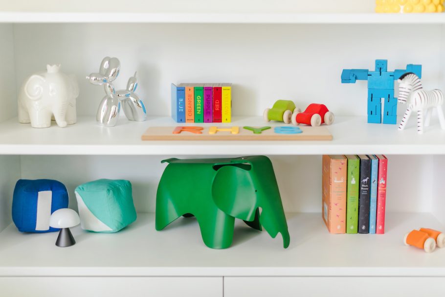
The toys in this nursery were considered to be part of the design and we chose each one carefully. They all coordinate with the room and have a fun modern feel.
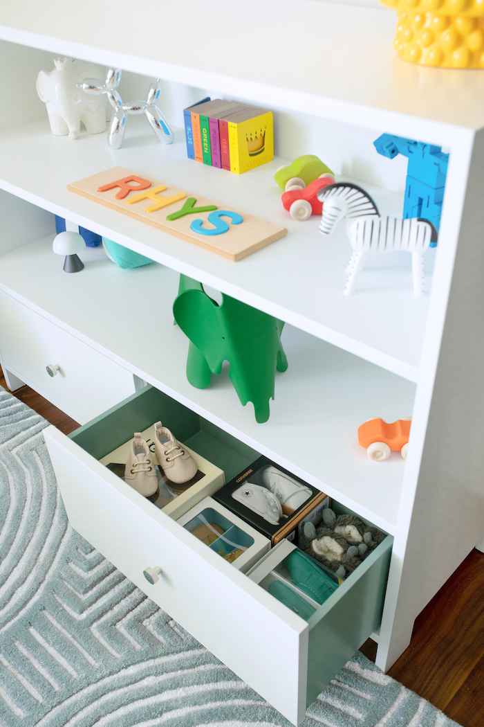
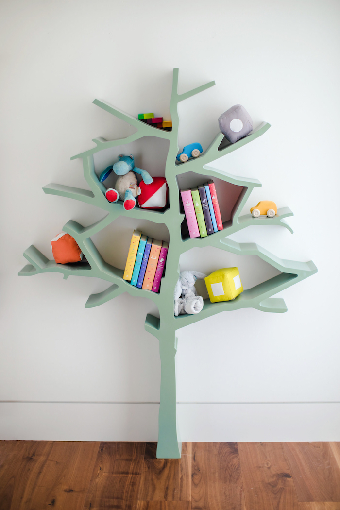
One of my favorite little things about this nursery is that the inside of the drawers on the bookcase and changing table are painted to match the green in the curtains and on the tree bookcase. It’s a fun little surprise!
[et_bloom_inline optin_id=optin_10]
