It was raining for several days straight here in SoCal, which is amazing—we need the water! But if you’re anything like me, part of you loves the overcast and dreary weather and the other part wants to curl up on the sofa with kleenex and a cathartic movie (A Walk to Remember is my go-to). Believe it or not, I’m about to tie this into design…
Our environment absolutely affects us. You might be well aware that you feel more tired and a little sad on a rainy day, but pay attention the next time you’re in an all gray room with dim lighting and see if you don’t feel just as tired and sad.
As a designer, I pay close attention to this. The thing is, everyone is different. Personally, I need a lot of natural light and bright cool colors to feel at ease. Put me in a space with more earthy tones like orange and brown and I will feel claustrophobic and icky, whereas other people might feel warm and comfortable. It’s part of my job to tease this out of my clients to make sure I give them not only a great looking space, but a space that makes them feel good, emotionally and physically.

The nursery is a place where you’ll want to feel comfortable, joyful and serene. For some clients, I achieve this with soft neutral tones. For others, it’s bolder color. Typically I can glean a lot of information by what my clients have done with the rest of their home. If I can sense any general themes, that gives me insight into what might make them feel at ease in the nursery.
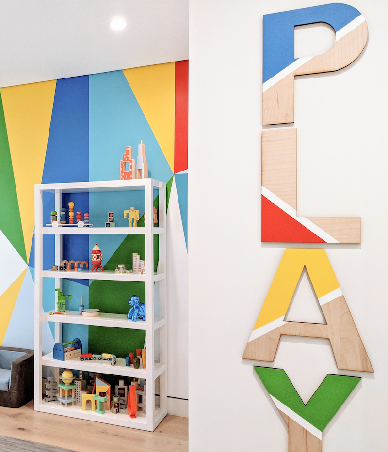
All that said, playrooms are a totally different ballgame! There’s more opportunity for bolder color because the idea is to feel playful, not necessarily calm and serene. But again, that’s up to the parents and how they want to feel in any space in their home.
Stay tuned for more photos of my colorful playroom project!
[et_bloom_inline optin_id=optin_10]

