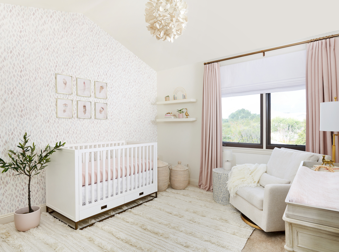
We had a client in Los Angeles, CA, who was looking to have a nursery designed for their second child. The home was on the modern side, but furnished with some beachy and bohemian touches. So naturally, they wanted the nursery to feel like it flowed with the house, but to also have some flair of its own.
The room had a high vaulted ceiling and they knew right away that they wanted wallpaper in the space. When we saw it in person, it was so clear how perfect that would be! The light from the window was soft and natural and really highlighted the accent wall, which just so happened to be where the crib was going!
 Watercolor Leaf Wallpaper | White Crib | Neutral Glider | Inlay Side Table | Neutral Boho Rug | Faux Olive Tree | Neutral Storage Baskets | Custom Blush Blackout Curtains (Contact Us) | Floral Chandelier | Feather Wall Art | Gold Floor Lamp
As with any nursery design that has wallpaper, the first step is choosing that pattern. The entire color palette of the room will depend on that wallpaper, so it always needs to get chosen early on. We chose a bunch of samples, mostly in neutral and blush tones, and eventually settled on this gorgeous leafy pattern. In person, it has such a variety of colors! There’s blush, taupe, gray, and even a hint of lavender and blue, so that allowed us to pull from that with the rest of the design.
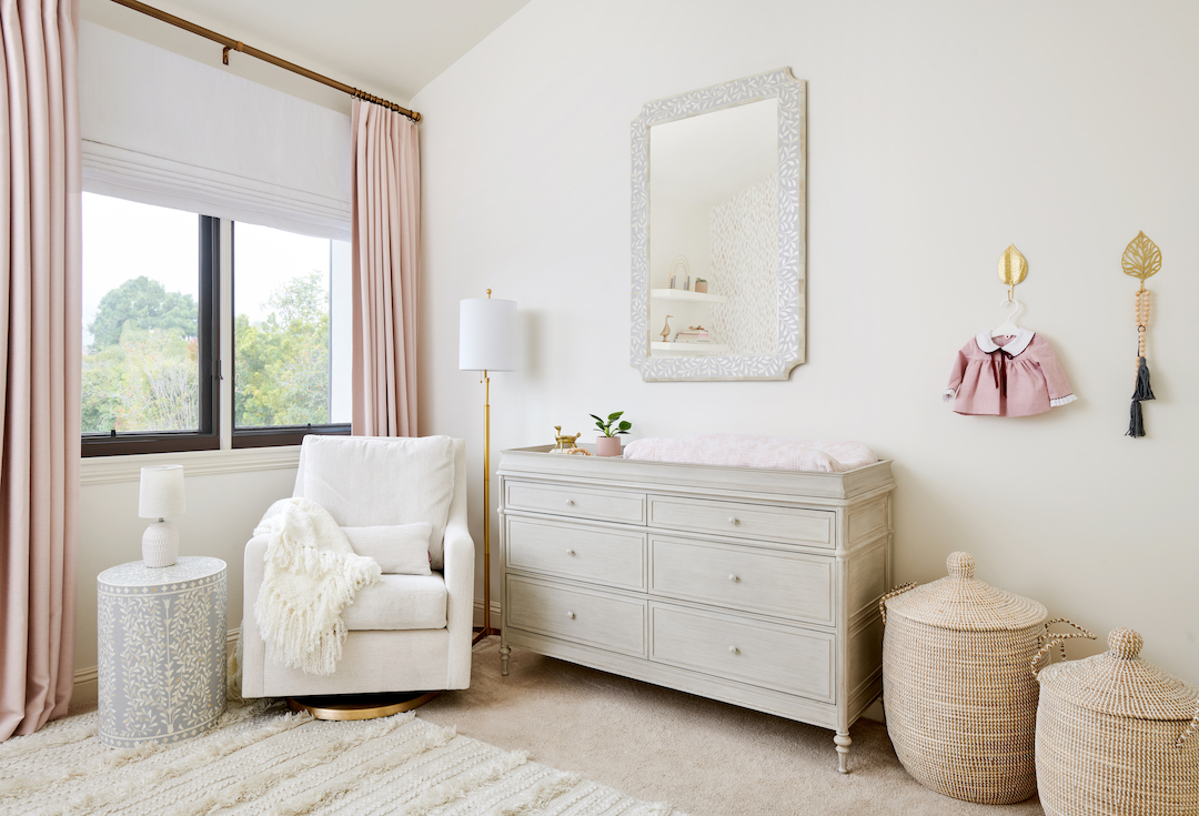
The furniture is mismatched, which is a look that we’re loving more and more these days! The crib is white and gold and has a more modern feel, while the dresser is a distressed gray with a more traditional style. The neutral glider is right in between, helping to pull the two styles together.
 Neutral Glider | Inlay Side Table | Neutral Boho Rug | Neutral Storage Baskets | Custom Blush Blackout Curtains (Contact Us) | Gold Floor Lamp | Distressed Grey Dresser | Grey Inlay Mirror | Gold Leaf Wall Hooks
As I mentioned above, the window was large and bright, so it was important to add window treatments to really block out the light. We added a white roman shade and layered blush blackout curtains on top for flexibility and a finished look.
Since the wallpaper had a leaf design, we pulled in some other accents that had something similar, like the side table and mirror that both have leaf inlay details. The gray color of those items also pulls from the gray in the wallpaper, while the distressed texture of the dresser adds a relaxed feel to that side of the room.
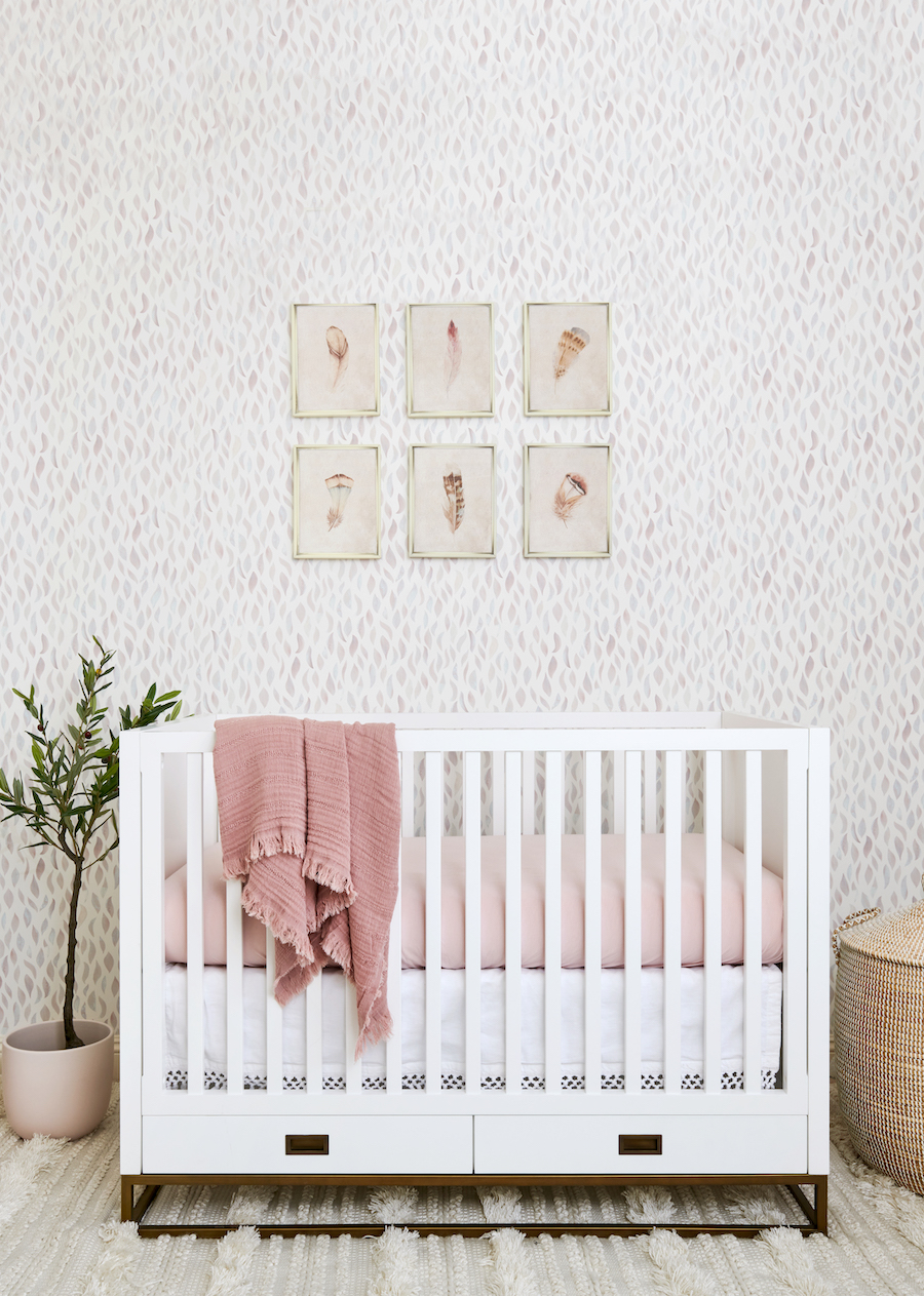
 Watercolor Leaf Wallpaper | White Crib | Neutral Boho Rug | Faux Olive Tree | Neutral Storage Baskets | Feather Wall Art | Macrame Crib Skirt
We took great care choosing the artwork in this room because any artwork that gets hung on top of wallpaper will damage the wallpaper where it’s hung (where the nail holes go). We found this set of feather art prints that were so sweet, and pulled in some great color. They came in a set with glass, so the first thing we did was remove the glass and replace it with light-weight plexiglass. However, they still went over the crib, so we took many extra safety precautions when installing. They have security hardware on the back, and then we adhered them to the wall with an extra adhesive just ti be triple-safe!
Interested in a nursery design of your own? Check out all our interior design service options, for local clients in Orange County and Los Angeles, and E-Designs for nationwide clients.
Photos by Lauren Pressey
*This post may contain affiliate links, but don’t worry, I only link items that I 100% recommend! You can view our Disclaimer here.

