I always get so excited when I have a nursery E-Design client from a major city like New York. The architecture and interior style of homes is so different depending on where you live, so it’s fun to work on projects in different areas. Since I’m based in Southern California, New York City is about as far across the country as you can get! I’ve done a lot of E-Designs for clients in New York, and they are some of my favorites.
This E-Design client wanted a fresh and modern nursery that also had some Scandinavian touches with light wood and white. She liked the idea of a combination of light blue and dark blue, but then it all came together when she saw this amazing abstract wallpaper. The color palette was so bold and fun, and then we just based the rest of the color scheme around that statement piece.
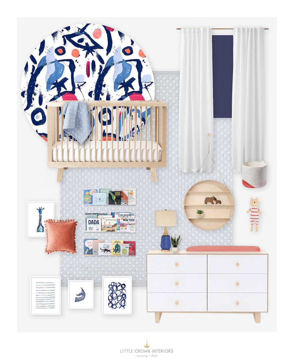 Crib | Dresser | Abstract Wallpaper | Rug | Pillow | Acrylic Wall Ledges | Round Wall Shelf | Giraffe Art | Stripes Art | Circles Art | Whale Art | Table Lamp | Crib Sheet | Storage Bin
Since she wanted light wood and white nursery furniture, I chose an eco-friendly crib in a natural wood tone and a two-tone changing table with a white front to bring that pop of white. A subtle light blue rug anchors the space, and also coordinates with the light blue tones in the wallpaper.
This nursery had a bit of an odd layout, so one of our challenges was choosing which wall to put the wallpaper on. I usually suggest that nursery wallpaper go on the crib wall, but it just depends. After looking at all the options, we did ending up suggesting it for the crib wall. We were also working around a twin bed that needed to stay in the room, which is why there isn’t a glider in this design. The twin bed took up a lot of space, but luckily we were still able to fit the crib and full-size dresser in here!
The color palette of navy, light blue and coral is unique and colorful and I can’t wait to see this nursery come to life!
*This post may contain affiliate links, but don’t worry, I only link items that I 100% recommend!*
