It’s time for another design reveal! This nursery was so fun to create, and I just love how soft and subtle it is. When this client contacted me, she knew she wanted something neutral and serene, and she loved animals. She hinted at the idea of a wallpapered accent wall, and of course, I convinced her to wallpaper the whole space—in something subtle, of course, with a soft enough pattern that it wouldn’t overwhelm the space.
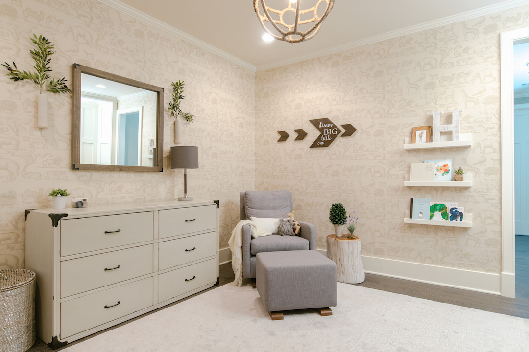
It took a while to choose the wallpaper since it needed to be mellow enough so as to respect the serene tone, and it also had to have an animal pattern (but nothing too juvenile so the wallpaper can last many years). We settled on the perfect animal pattern wallpaper that had a hand-drawn feel and was grown-up enough to be versatile. I wrote a post a while back about the process of choosing said wallpaper, along with some of the alternative options, in case you’re interested.
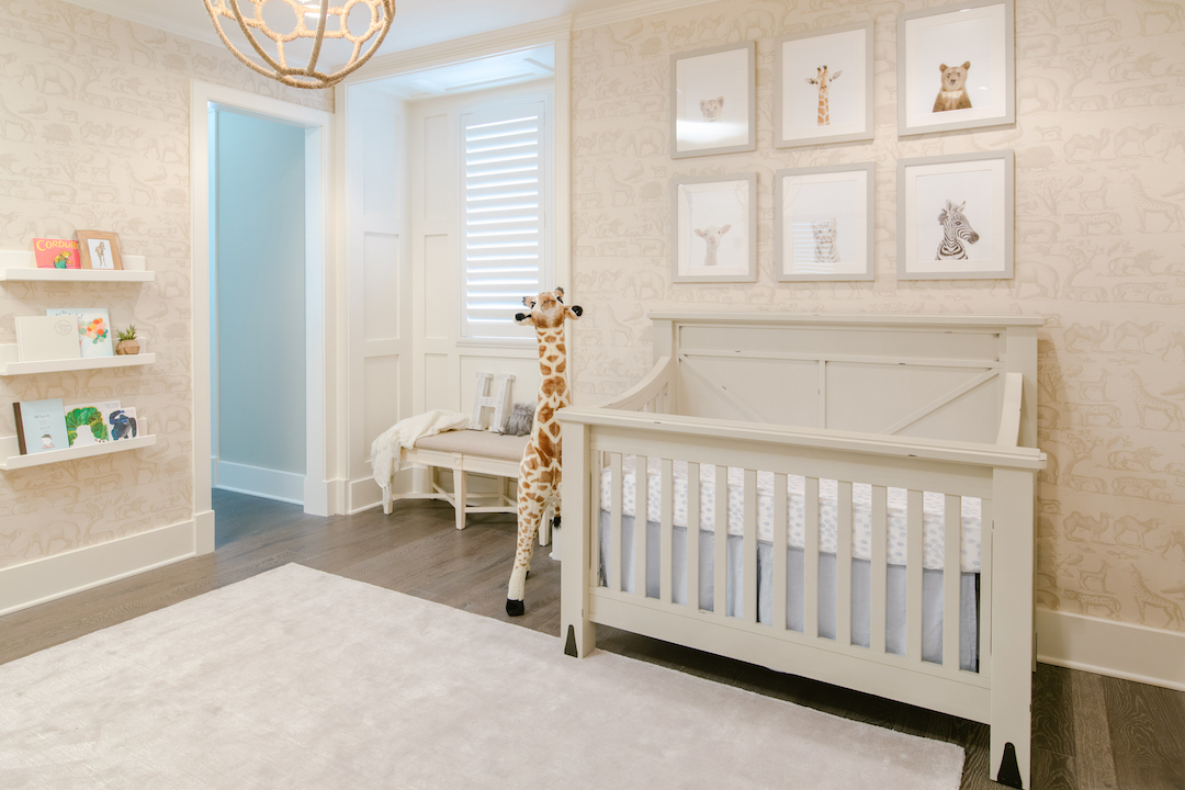
I chose a gorgeous neutral furniture collection that has a slight rubbed finish to add some warmth and texture to the space. The small iron details also add a touch of masculinity to pair with the very subtle pale blue accents. This nursery was for a boy, but we wanted it to feel very general neutral so everything could be used again for the next child.
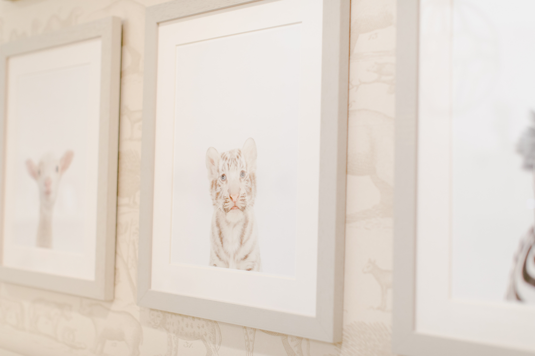
Any animal-themed nursery has to have these baby animal photographs, and my client was in love with them from day one. Half the fun is going through all the options and choosing the right combination of animals. Of course, these are framed with plexiglass instead of real glass since they are hanging over the crib, and they are very well secured to the wall.
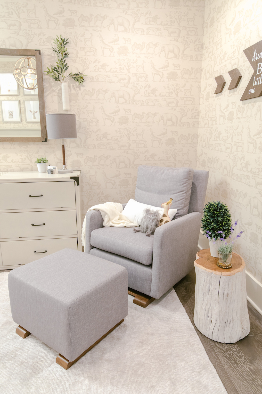
I love the combination of taupe and gray. It may sound like two neutral tones will compete, but they actually work so well together, especially since the wood flooring has so many variations of color. We also pulled in elements of ivory and white. We used one of my all-time favorite nursery gliders—every client I’ve suggested it to loves how modern it is while still remaining cozy and comfortable.
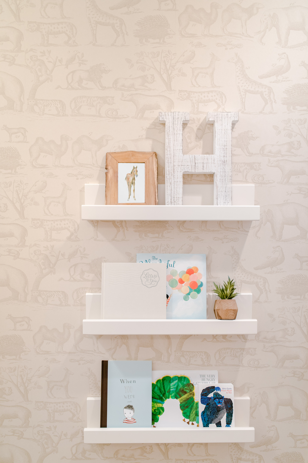
Wall ledges are such a great option for books because they also make use of the books as an art display. I paired the books with some little art and decor pieces to pull the look together.
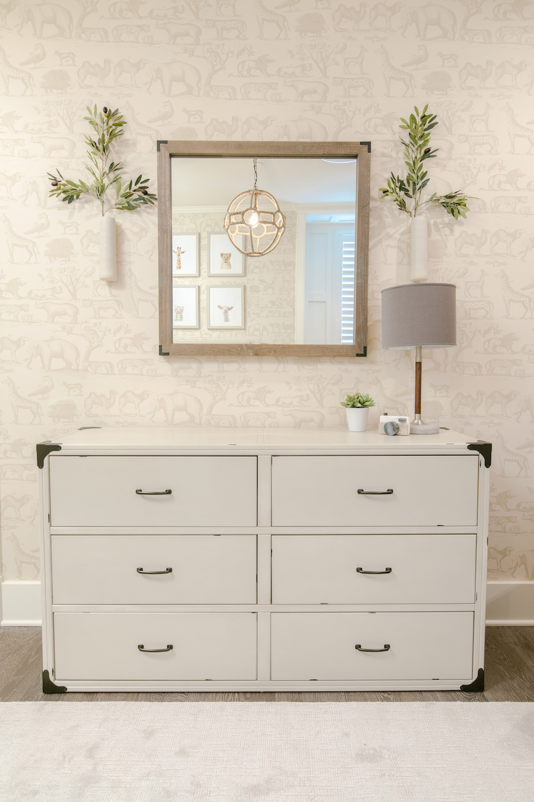
This nursery, like most, isn’t a very large room, so I opted to add a mirror over the changing table which helps to open up the space and bounce light around the room. I love how it reflects the rope light fixture as well. Lastly, I always try to sneak in some greenery if at all possible, and these little wall vases were the perfect way to do that!
To see even more photos of this space, check out my portfolio.
Images by Full Spectrum Photography
[et_bloom_inline optin_id=optin_10]
