It seems like e-designs have become very popular in nursery design lately as technology is allowing interior designers to work across the country remotely. I’ve been getting more and more requests for nursery e-designs, and I just love how it allows me to create a nursery space for anyone, no matter where they live. I was contacted by a client who wanted a very specific look in her nursery—all white. This is actually much more of a challenge than it may seem! As anyone knows who has ever tried to choose a white paint color, there are hundreds of shades of white, and they all have a subtle yet different undertone. Matching whites can be very difficult, especially when ordering products online.
But before we get into the color, or lack thereof, we needed to nail down the floor plan. This client had a large space with high ceilings and a unique curved wall. The floor plan came together fairly easily, as there was really only one wall that would work for the crib. Putting the crib on any of the other walls would have either blocked a walkway, a sight line, or posed a safety hazard (such as in front of the window).
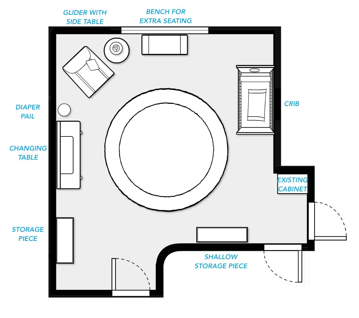
My client knew she already wanted to use the Oeuf Sparrow Crib in, of course, white. I didn’t want the design to feel overly coordinated since we were already limited on color, so I opted to choose the other furniture pieces from different brands. Here is where matching whites comes in. The key here is to include enough variety that each white may be slightly different, but the eye won’t land of any one thing in particular. The problem happens when 95% of the items are the exact same shade of white and then one item is off and stands out like a sore thumb. An advantage we had in this room was the size of the space. None of the major furniture pieces are cramped directly next to each other, which makes it harder to tell if they are even off at all. In person, everything blends nicely.
As I was choosing the smaller accessory items, I kept in mind that her taste was modern, and that she wanted some celestial elements as well. Rather than bringing in an accent color, I brought in some contrast by using silver and gray so the room wouldn’t feel too overwhelmingly white.
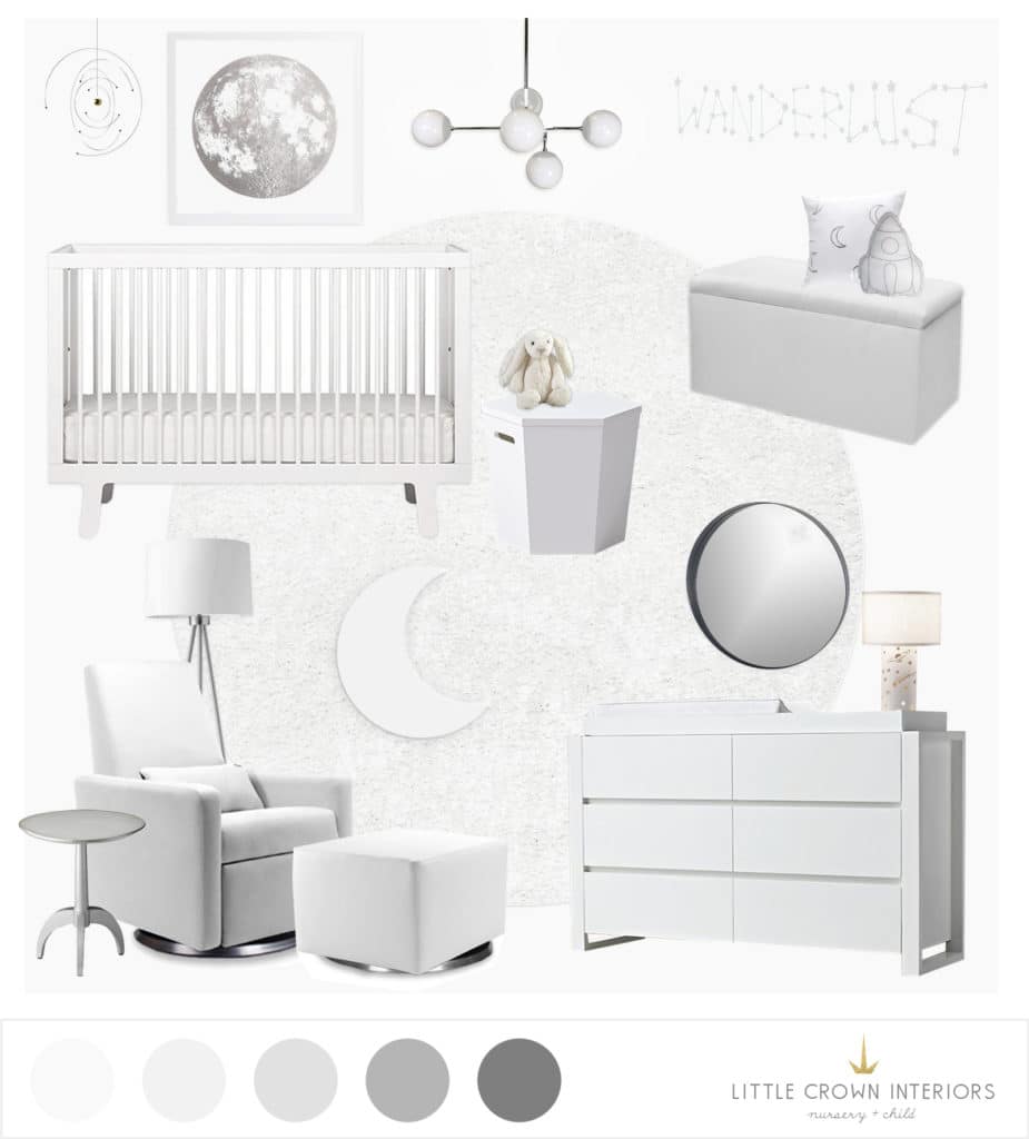
Mobile | Planet Art | Crib | Pendant | Storage Bench | Wanderlust Decal | Rocket Pillow | Moon Pillow | Changing Table | Glider | Side Table | Floor Lamp | Rug
By mixing sleek modern items and straight lines with curved and softer items with some celestial whimsy, the nursery feels fresh and bright, but not boring. Even though this nursery was an e-design, the client actually lived nearby, so I was able to photograph the space. Stay tuned to see the final photos!
*This post contains affiliate links, but don’t worry, I only link products that I 100% recommend!*
