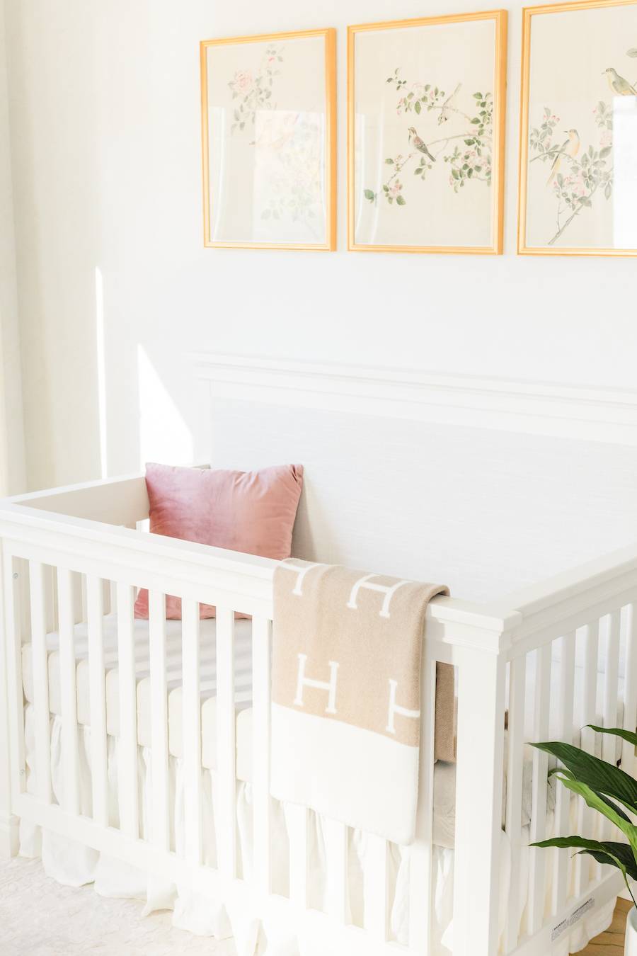
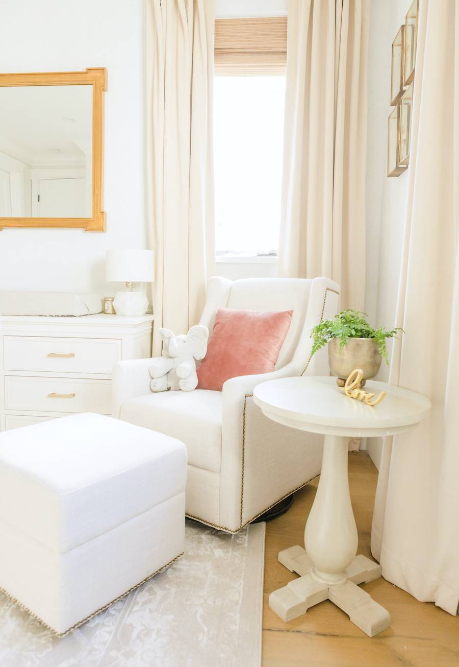
Neutral nursery designs have been getting more and more popular over the last few years. Maybe it’s because a neutral space is serene, relaxing and so versatile. In a nursery especially, versatility is super important since the space will change over time. I’ve been getting lots of requests for neutral nursery designs from my clients, and I’m so excited to reveal my newest design—a neutral and gold nursery for a client in Los Angeles, California.
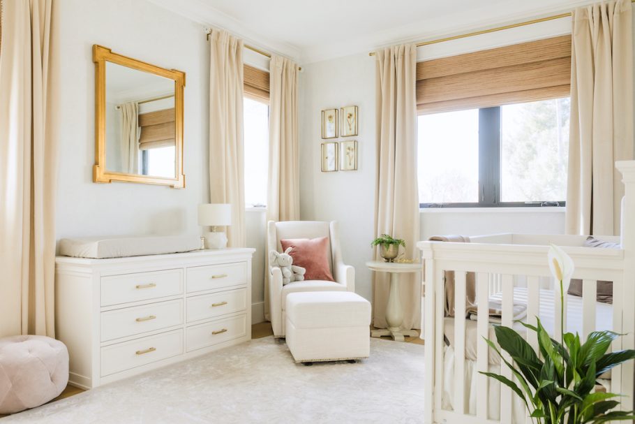 Crib | Dresser | Rug | Glider & Ottoman | Curtains | Mirror
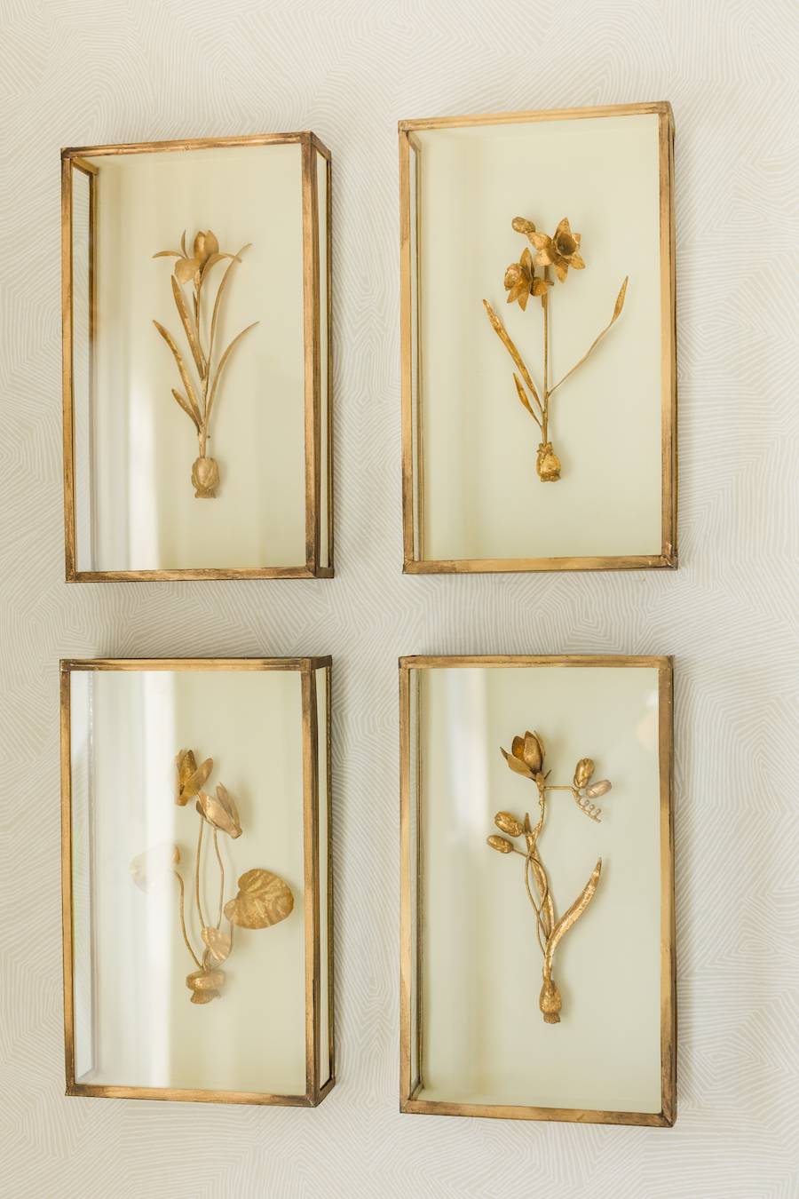
This nursery belongs to Naomi Boyer, and you can see even more details of this gorgeous space on her YouTube channel (she did a whole reveal video). When Naomi contacted me, we first laughed about having the same first name and then got to talking about the nursery details. She wanted a neutral and sophisticated space for her baby girl. I started by sending her some neutral wallpaper options, and we finally decided on a stunning paper from Schumacher. It’s hard to see in the photos, but it’s seriously gorgeous in person!
We then moved onto furniture. The crib has a neutral linen upholstered panel, which brings a softness to the space.
We chose the glider and ottoman because of its gorgeous neutral design and the gold nailhead accents that give the piece a more refined look.
We rounded out the whole room with a gorgeous neutral rug with a damask pattern, which pulled the entire design together. It has a mix of neutral tones, which give it texture, and the pattern adds visual interest to the floor.
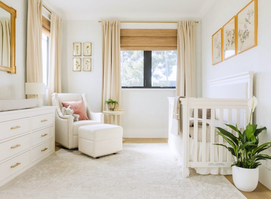 Crib | Dresser | Rug | Glider & Ottoman | Curtains | Mirror | Art Prints
You can definitely see the wallpaper better in the photo below. It has such a soft and subtle pattern, but it adds so much to the room in person. Neutral, beautiful, and versatile!
*This post may contain affiliate links, but don’t worry, I only link items that I 100% recommend! You can view our Disclaimer here.
