One thing I love about nursery design is that every client has a different vision for their space. This client had a fairly traditional home in Newport Beach and wanted a sophisticated and elegant nursery for their baby girl. They weren’t big fans of pink or other typically “girly” colors, and wanted the nursery to feel calming and serene.
We initially started this design with wallpaper behind the crib, but ultimately decided against it so the room would feel more mellow. Most of the nursery has a traditional style, but we used some transitional and modern touches in the furniture to give it an eclectic feel.
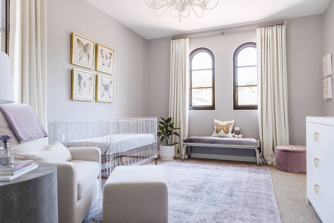 Silver Velvet Bench | Lavender Rug | Acrylic Crib | Neutral Glider | White Changing Table | Mauve Ottoman | Floral Chandelier
This nursery came with great bones—the wood arched windows really give the space warmth so our cool grays and lavenders didn’t feel too cold. We also worked in some gold accents, but if you look closely, you’ll see we used silver as well for a mixed metal look!
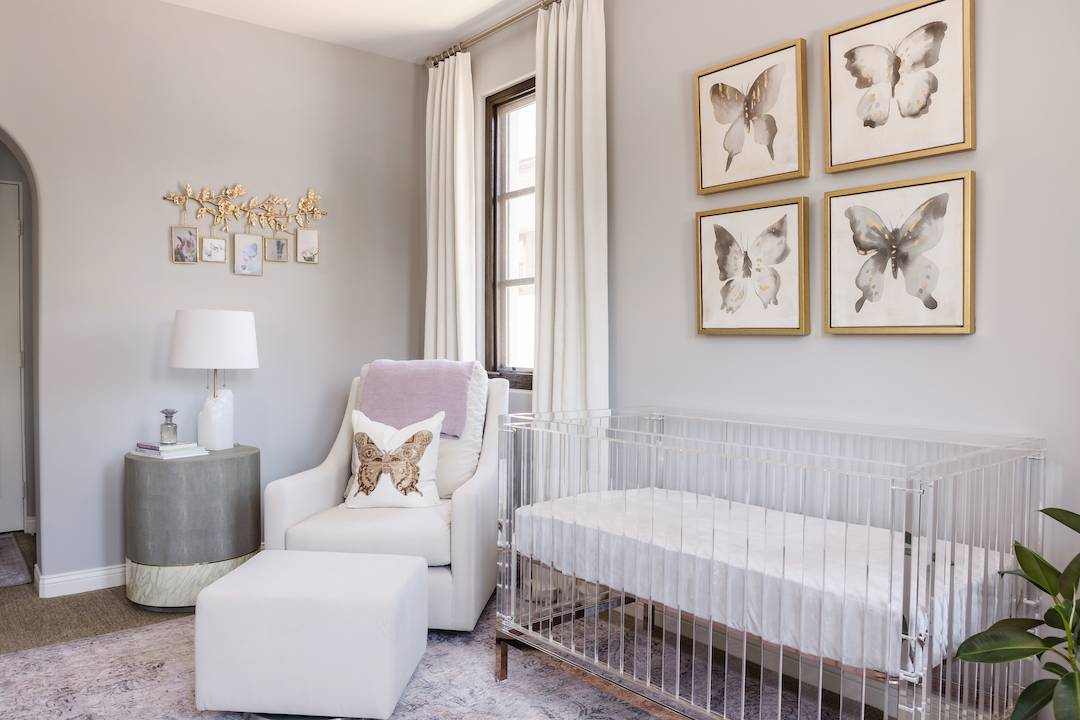 Lavender Rug | Acrylic Crib | Neutral Glider | Alabaster Lamp | Gold Butterfly Pillow | Gold Wall Frames
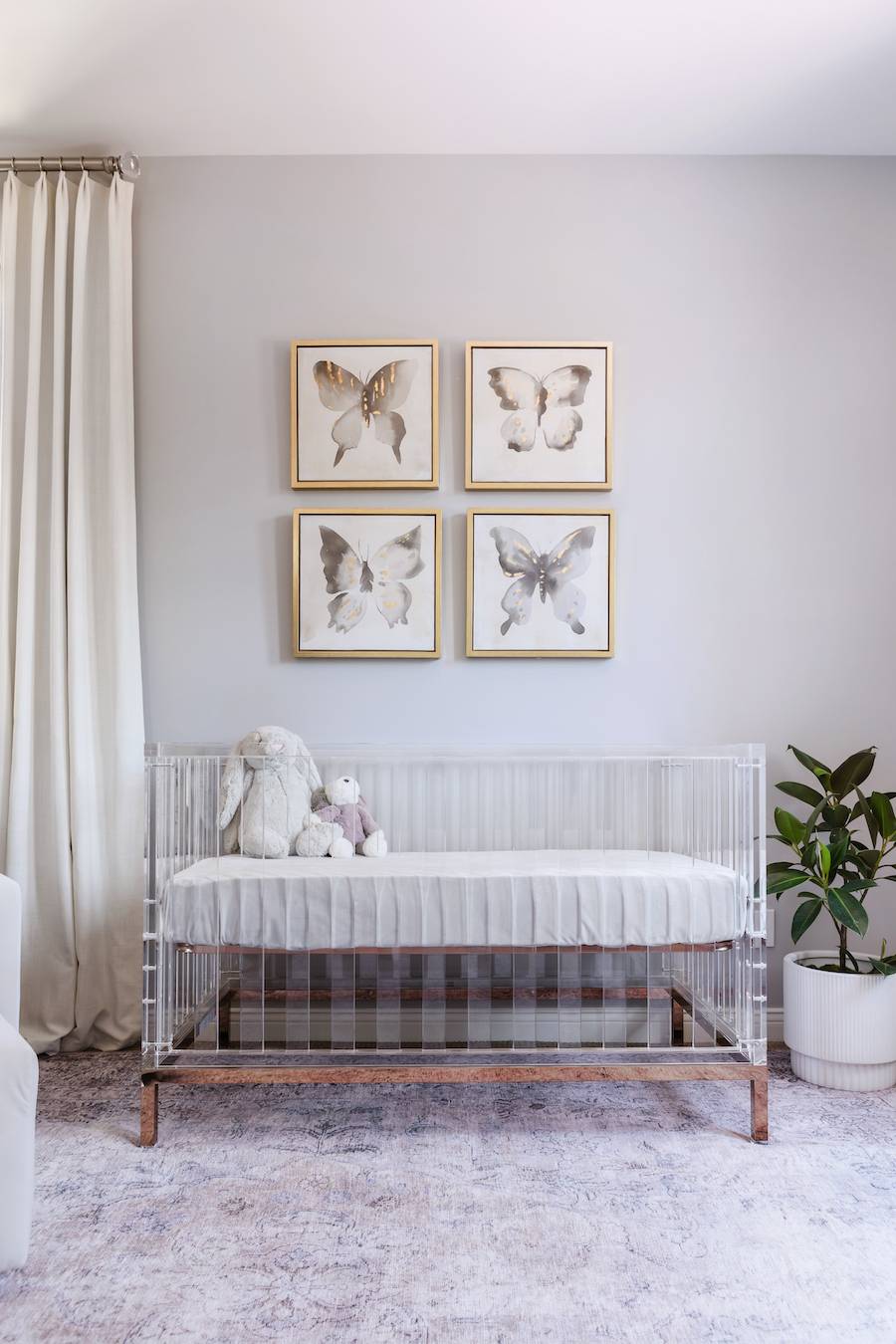
You may have noticed that butterfly decor for nurseries has been on the rise! Butterflies were very special for this client, so we incorporated them into the space in a few ways. We did 4 butterfly art pieces above the crib (all very well secured), and a gold butterfly pillow. There are also some gorgeous gold butterfly wall hooks by the changing table (which you can see below) and a few little butterfly art pieces behind the entry door to the room. We didn’t go nuts with the theme, just little hints here and there for an elegant look.
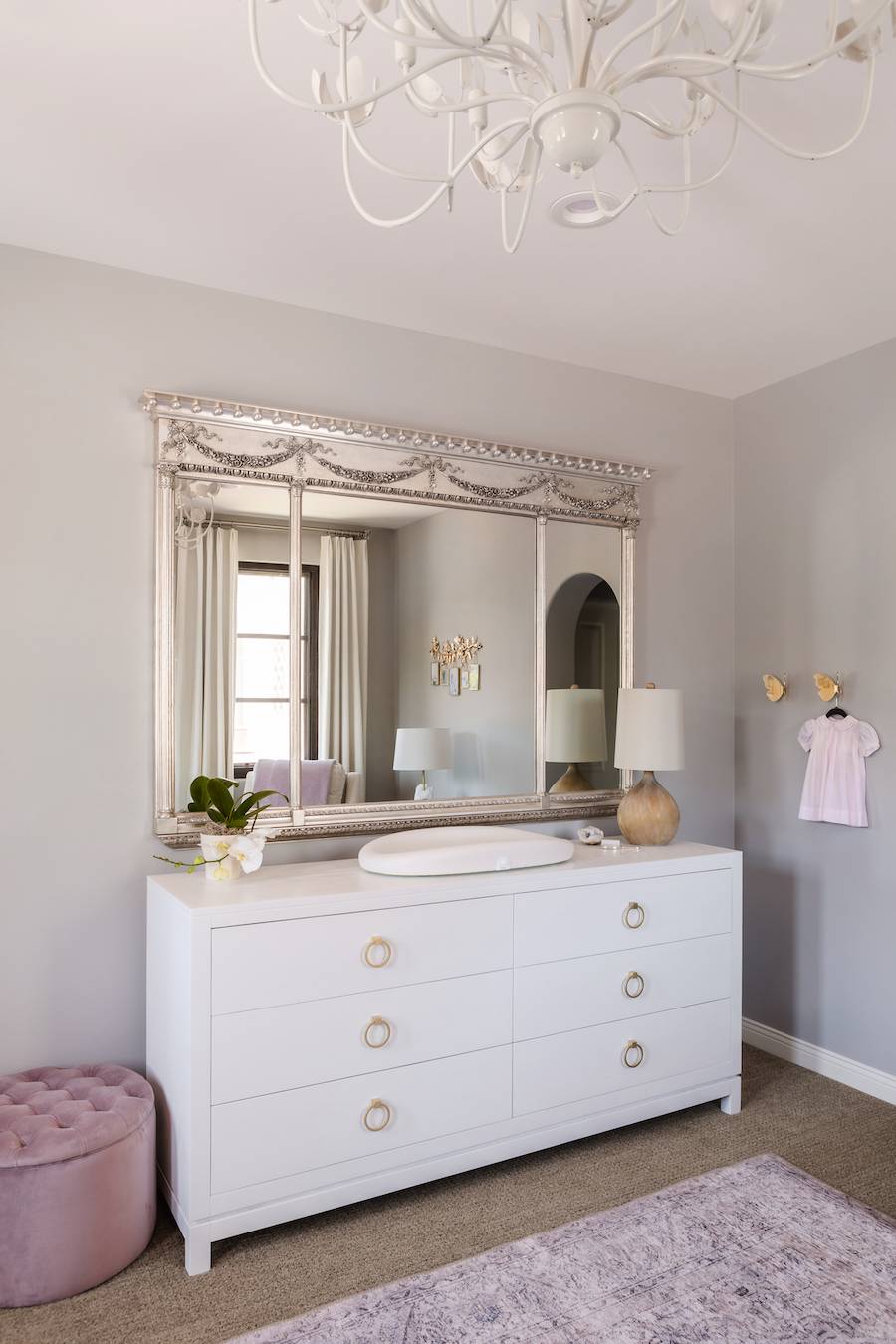 Lavender Rug | Acrylic Crib | White Changing Table | Mauve Ottoman | Floral Chandelier
One of the best featured of this nursery design is the stunning large silver mirror over the changing table. That piece is an antique that belonged to my client’s family, and we had it refinished in a warm silver. We used gold accents on the dresser to balance the look since we did mixed metals in the space.
Since this nursery had a lot of windows, we also made sure to include blackout curtains. We had them custom made in a soft white textured fabric with a pleat top for that touch of traditional style. They work so well next to the modern acrylic crib! The butterfly art on the wall is the perfect balance of modern and traditional, tying everything together.
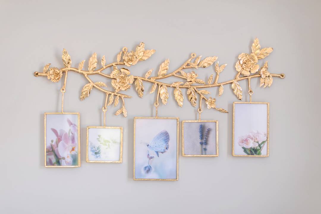
We found this gold wall frame piece later on in the design process and knew it had to be included! We filled it with little photographs of flowers and butterflies to tie in the lavender hues in the space. They are easy to switch out with the client’s personal photos.
Looking for a nursery design of your own? Check out our design services for more info!
*This post may contain affiliate links, but don’t worry, I only link items that I 100% recommend! You can view our Disclaimer here.


Hi! I’m looking for the lavender rug in these pictures but when I click on the links, it takes me to a much grayer looking rug that’s called “slate.” Is this the same rug? They look very different.
Hi there! Yes, that’s the correct rug. It photographed a but more lavender/blue because of the light bouncing off of the walls too. It’s really hard to tell from an online photo. I would suggest order a sample or the smallest size to see if you like it!
Hi! May I ask for this beautiful paint color?
Hi there! It’s Sherwin Williams Light French Gray. It’s much more gray in person. It looks a little lavender in the photos because of the way the light was reflecting off the lavender rug.
Where is the butterfly art from?
Unfortunately those have been discontinued, so we don’t have a link for them. Sorry!