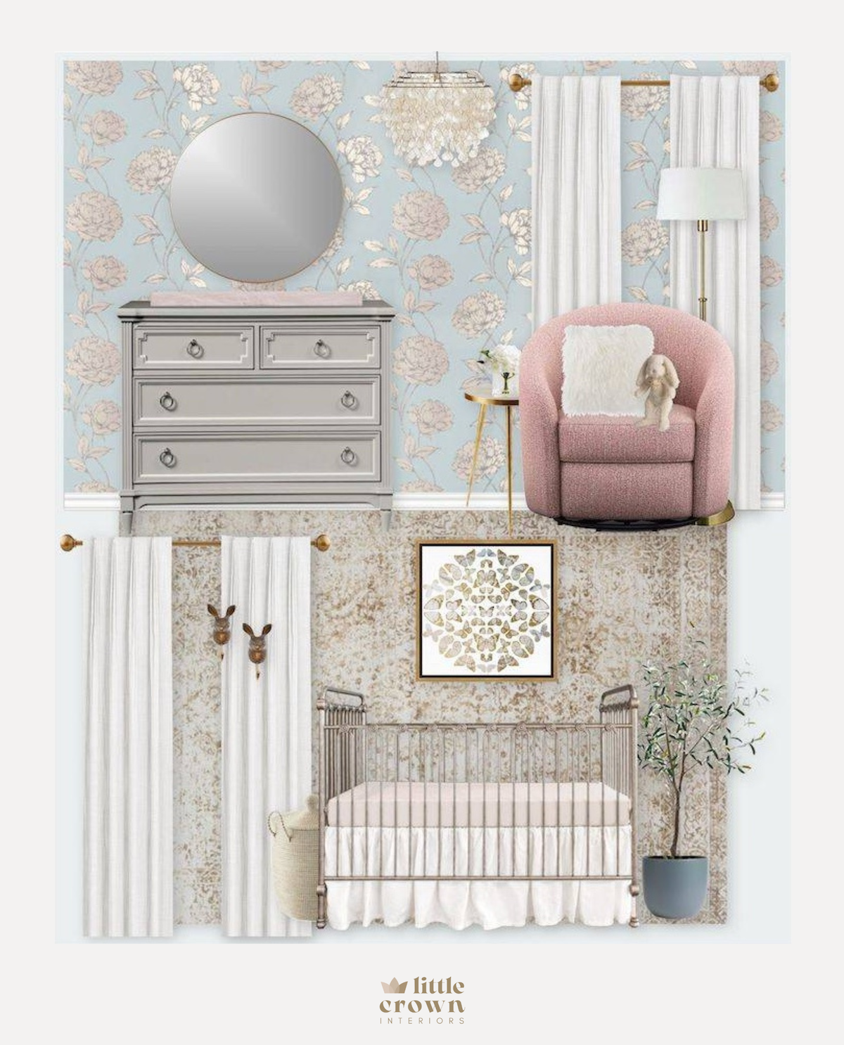
One of the things I love so much about doing nursery Virtual Designs is that they are all so different. This client had a very unique home in New Orleans with beautiful architecture, super high ceilings, and low windows that are common to the area’s aesthetic. She wanted her nursery design to feel whimsical and soft, while fitting the style of the home.

Crib | Glider | Wall Ledges | Side Table | Floor Lamp | Chandelier | Rug | Butterfly Art | Mirror | Wall Hooks | Faux Olive Tree | Planter | Window Treatments | Pillow | Plant | Toy Bunny | Crib Skirt (Similar) | Hamper
We started with the wallpaper—of course! Her inspiration photos had soft blues, grays and greens, so I found this stunning pale blue metallic wallpaper with a rose gold sheen. The room isn’t huge (nurseries never are!) so I made sure to choose a wallpaper pattern that wasn’t too dark or overwhelming. The room has a lot of windows and doors to help break it up as well
We also went with a pewter iron crib. I don’t use iron cribs a lot—not because there’s anything wrong with them, but most of my clients prefer wood cribs. But for this room, I felt that the iron crib made a lot of sense. It has that traditional vibe, and also doesn’t take up as much visual space. I usually use an acrylic crib for that purpose, but acrylic didn’t work for this style.
To cover all the windows (there were 3!), we chose tailored white blackout curtains to block out as much light as possible. The windows also already have a soft roman shade over them, so there will be options for both.
This nursery design also has mixed metals, which I love! The wallpaper has rose gold, the curtain hardware, art frame and side table are gold, and the dresser hardware and crib are silver. Mixed metals are 100% okay to do so long as it’s all balanced.
Because the rose from the wallpaper brought in a warm feel, I wanted to balance that by using touches of blush throughout the room as well. We needed a small rounded glider, and luckily found a great one in a blush tone, and then used a softer blush crib sheet and changing pad cover.
Finally, the decor pulled the room together! The butterfly artwork over the crib is one of my favorites, and it works so well with the rabbit wall hooks and gold round wall mirror. And, of course, I added a faux plant to give the room a natural touch and a bit of greenery. I’m so happy with how this Virtual Design came out!
*This post may contain affiliate links, but don’t worry, I only link items that I 100% recommend! You can view our Disclaimer here.

