Every nursery E-Design that I work on has a challenge. Sometimes it’s small and sometimes it’s large, but in this room it was a fairly simple one—very high ceilings. It might seem like high ceilings are a bonus, and in most cases they are, but in a small room with extra-high ceilings, the room can feel a bit awkward with regular sized furniture. It’s important to choose furniture and decor in the right scale.
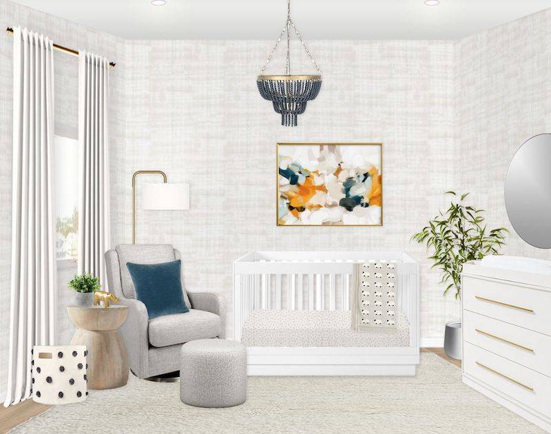
This client wanted a neutral nursery with some pops of color to flow with the rest of her home. She had sent in a few photos of her living room as well so we could see her general sense of style, and that was really helpful! We pulled a few tones of teal blue and oranges to layer on top of the neutrals, along with white furniture with gold accents.
· Nursery Details ·
Crib | Glider | Dresser | Side Table | Ottoman | Rug | Wallpaper | Abstract Art | Chandelier | Large Faux Plant | Large Planter | Floor Lamp | Pompom Bin | Blackout Curtains | Throw Pillow | Throw Blanket | Small Faux Plant | Organic Crib Sheet | Round Mirror
Here’s how we addressed the high ceilings in this nursery: First, we suggested a neutral wallpaper to go all the way up the walls to soften the space and add texture. Second, we included a nice statement chandelier that hangs down low enough to fill in some of that extra height. Third, we chose a large-scale art piece to hang over the crib, but kept it a bit lower so it didn’t look like it was floating up on the wall. And fourth, we went with blackout curtains hung high up on the wall so they didn’t look dinky paired with such high ceilings. Hanging curtains high up is a classic designer trick to make a room feel more appropriately sized. For more tips on blackout curtains, read our other post, The Ultimate Guide to Blackout Curtains for the Nursery.
Aside from the high ceilings, there were a few other small challenges in this nursery. The room had painted gray doors, so we needed to make sure that the design flowed with that and didn’t clash. We accomplished this by adding a few touches of gray in the nursery so it felt like the doors were part of the design.
The room was also in a home that was being rented. This is something that a lot of my nursery clients are up against. The solution? Removable wallpaper! The client was planning on staying in this home for a long time, but didn’t want to damage the walls. With removable wallpaper, you can get the cohesive nursery design you’re looking for without having to worry about removing it later—it just peels right off!
*This post may contain affiliate links, but don’t worry, I only link items that I 100% recommend! You can view our Disclaimer here.
