It’s time for another “Get the Look” post, and I have chosen this light and feminine floral nursery designed for Los Angeles local, Irene Khan. I get so many questions about this nursery, so I though it would be a good one to redesign for you!
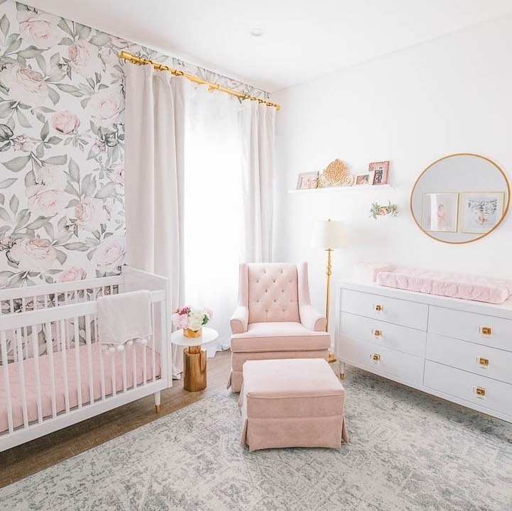
The color scheme was inspired by some of the client’s own photography of her daughter that she had done before the nursery was started. We then found the perfect floral wallpaper to pull out the shades of green, blush pink and gray.

Below is my “Get the Look” version of this nursery design. By choosing more budget friendly options for the higher end crib and dresser, I was able to really cut down the price of this space! Choosing a dresser and crib with similar glam gold detailing brought the same statement details to the design. Many of the secondary pieces were already moderately priced, but I still found ways to swap things around to help out a bit more on the budget. Perhaps the best find was this incredibly priced floral wallpaper which features many of the same characteristics of the original.
Get the Look Floral Nursery:
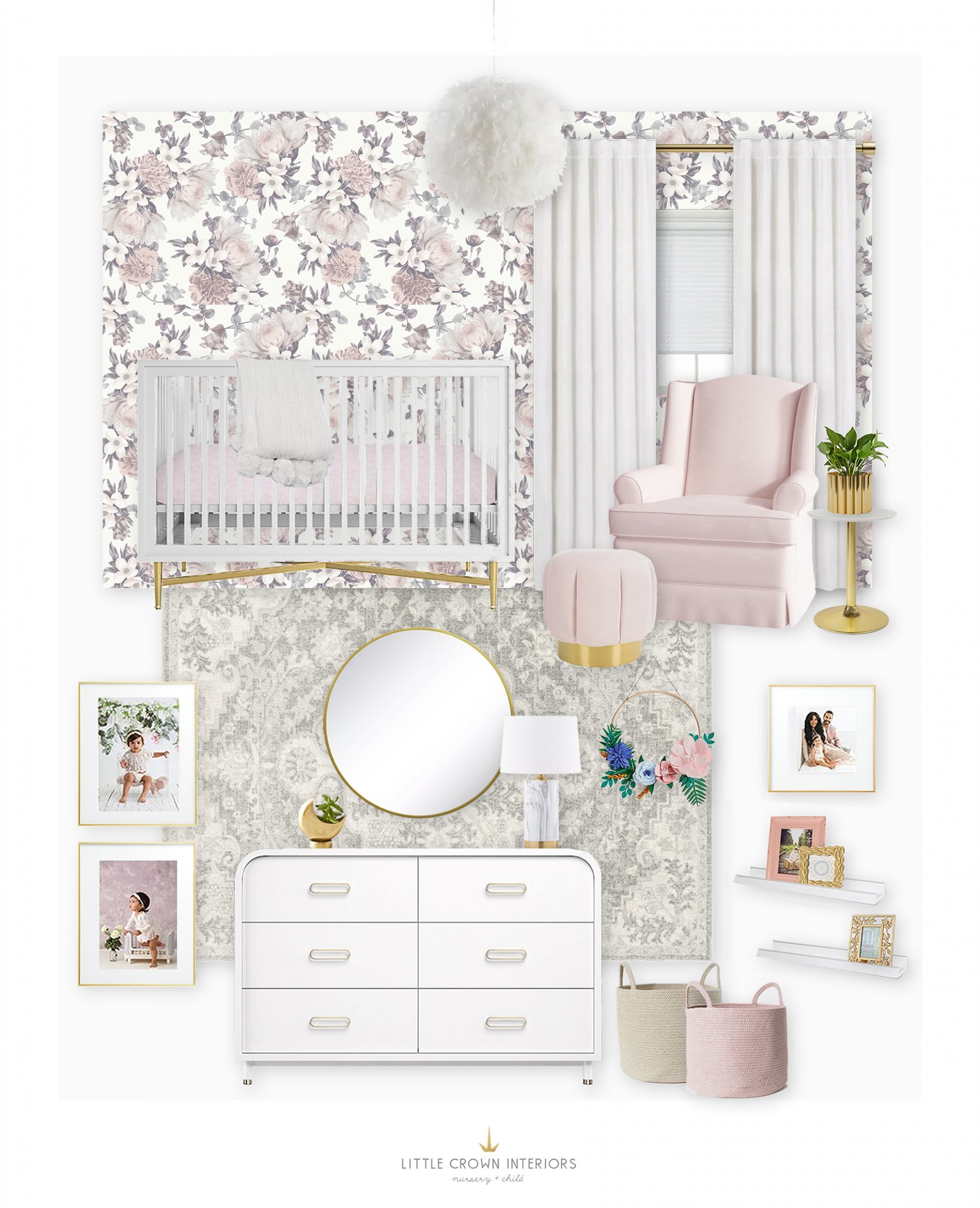
Crib | Dresser | Glider | Rug | Floral Wallpaper | Chandelier | Ottoman | Side | Table Lamp | Gallery Frames | Floral Wreath | Mirror | Throw Blanket | Gold Floral Frame | Blush Frame | Woven Baskets | Moon Planter | Scalloped Planter | Crib Mattress | Velvet Blackout Curtains | Brass Curtain Rod
Below you can see the original design board I created for this client. We ended up making a few changes here and there for the final, so I have tried to capture aspects from each stage for the “Get the Look” version.
Original Floral Nursery: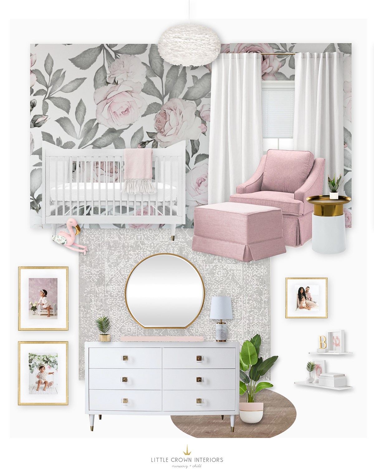
White Crib | White Dresser | Floral Wallpaper | Blush Glider | Gray Patterned Rug | Feather Chandelier | White & Gold Side Table | Marble Table Lamp | Gold Wall Frames | Pink Throw Blanket | Gold Wall Mirror | White Floating Shelves
When working with a large scale pattern on a wallpaper or wall mural I suggest choosing a focal wall for the application and painting the remaining walls a neutral color found within the palette of the paper. In the case of this project, a base of bright white worked perfectly, but you may find that a soft gray or beige better suits your own wallpaper selection. Another note that you can take from this nursery design is that you can combine shades of a color (in this case pink) without every piece being the exact same. The wallpaper offers a gradient of pink shades so feel free to draw from a variety of blush and pink tones!
I would love to hear any requests you have for future “Get the Look” posts! You can check out my portfolio for all my recent projects.
You can see more of the original finished nursery here, and even shop the whole room!
*This post may contain affiliate links, but don’t worry, I only link items that I 100% recommend!*
[et_bloom_inline optin_id=optin_10]
