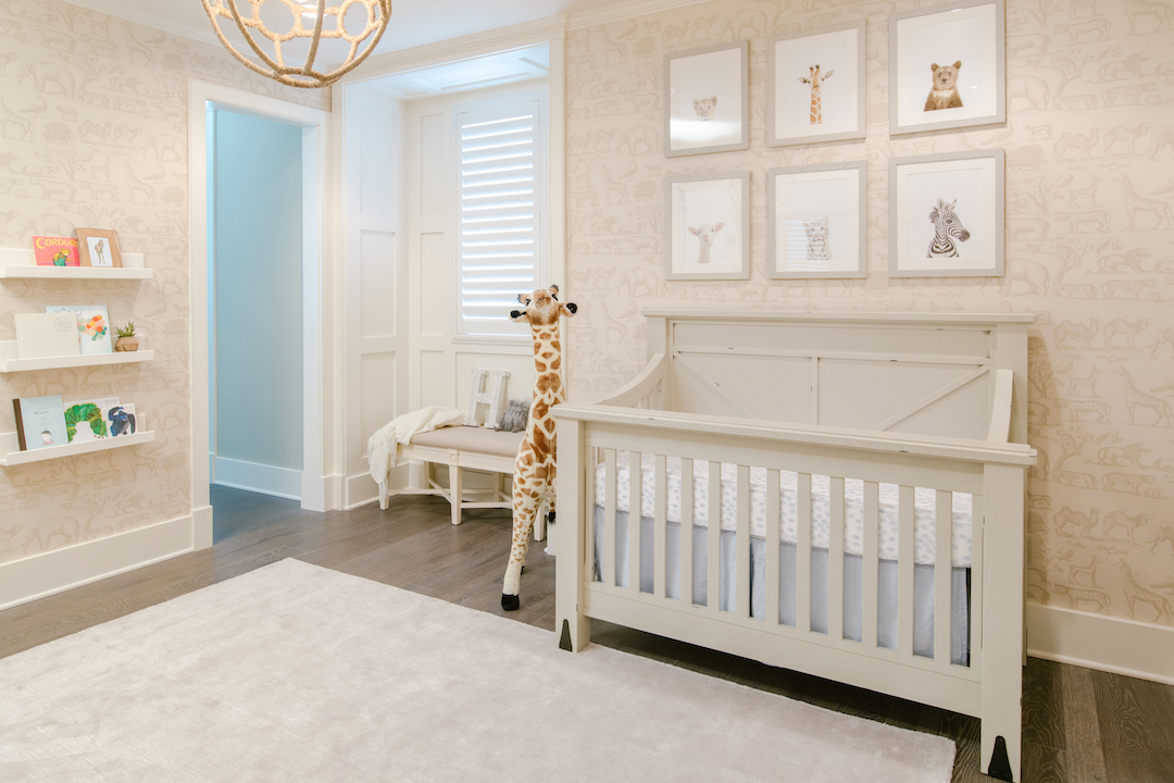
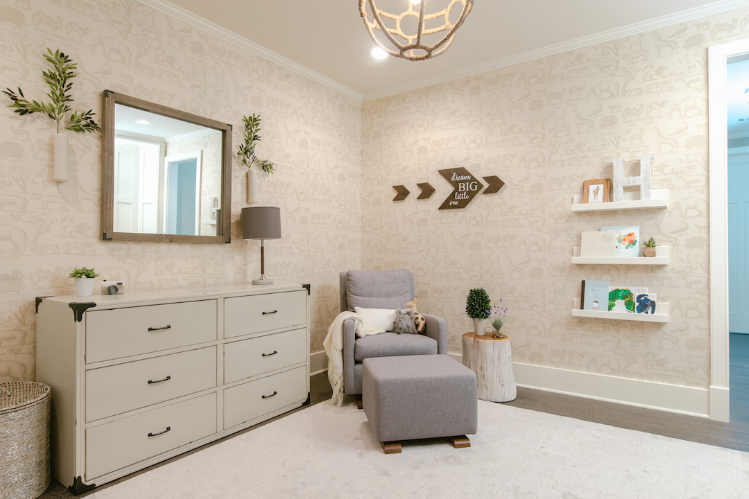
Gender neutral nurseries are becoming more and more popular! I have been receiving so many requests from clients to create genderless spaces, so I thought I would create another “Get the Look” post for you based on one of my most popular neutral nurseries! This serene safari themed nursery design is not only gender neutral (aside from a few little pops of blue, which I personally still consider gender neutral), but is neutral in color scheme as well. Monochromatic and all neutral color palettes do not have to be boring! Below is the original neutral safari nursery that I designed for a client in Los Angeles. As you can see, one of the things that makes this nursery so great is the wallpaper. We did wallpaper on all four walls, but if you’re trying to stick to a budget, you could always just do an accent wall or even the ceiling.  The furniture is neutral as well and has a little rustic farmhouse look to it. The modern glider is gray, which brings in another neutral, and we balanced that with the light gray rug, lampshade and a few other little accessories. I also really wanted to add greenery to this space to make it feel more cozy and natural, so you’ll see lots of plant life accents throughout.
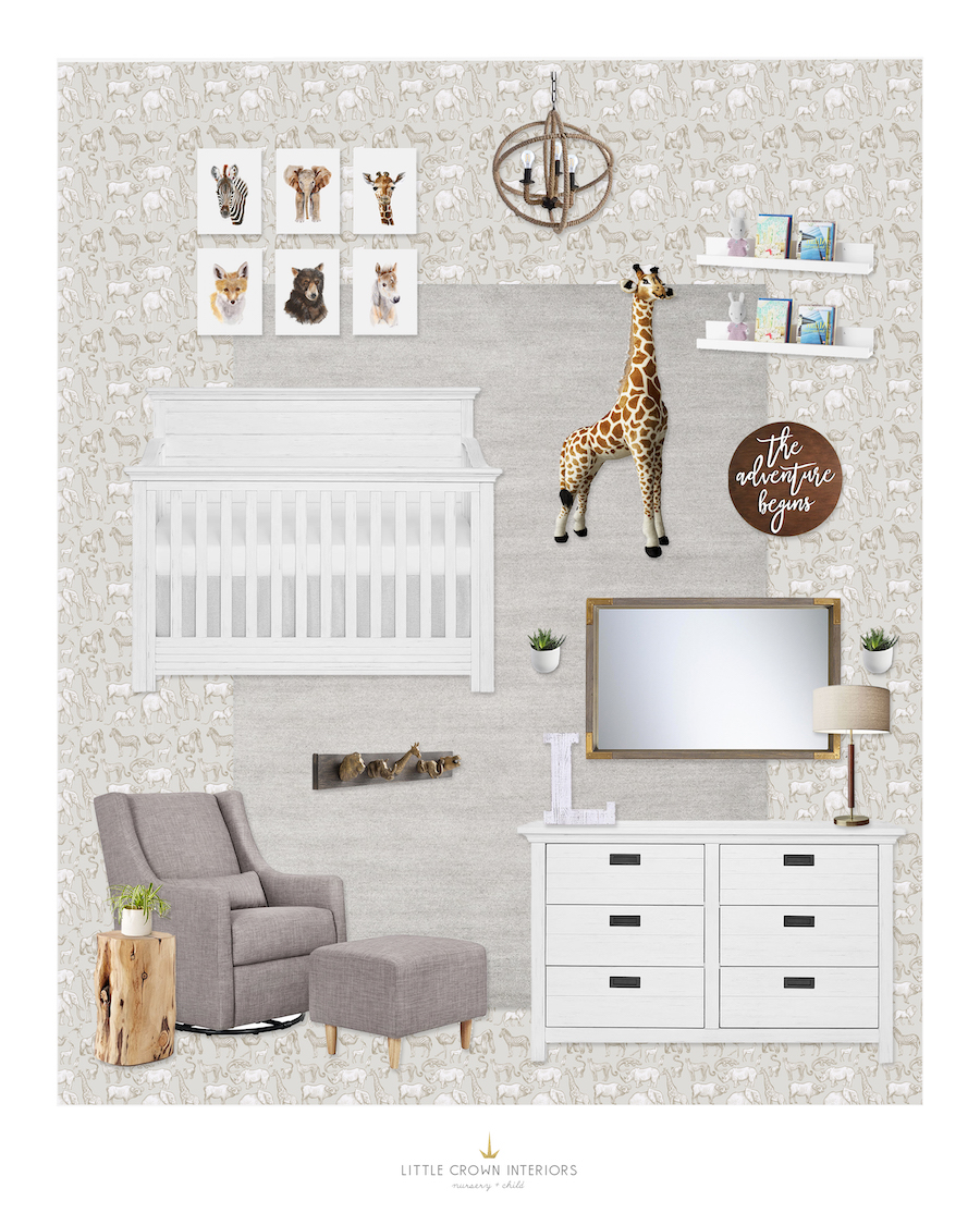
  For the “Get the Look” version below, I’ve replaced some of the key pieces that make up this neutral look. The focal point of the original design is the neutral safari animal wallpaper. (Check out this post if you want to learn more about how we arrived at this wallpaper in the first place). This pattern sets the foundation for this animal themed space. For the “Get the Look” version, I chose a different safari animal wallpaper that’s also removable and a bit more affordable.
  Rug | Animal Art Prints | Safari Wall Hooks | Wood Side Table | Table Lamp | Wall Mirror | Book Ledge Shelves | Plush Giraffe | Wall Planters | Wooden Letter | Wood Planter | Ceramic Planter
In order to cut down on the cost of this nursery design, I swapped in more budget-friendly choices for many of the other pieces to reduce the total cost. The “Get the Look” version is about half the cost of the original! Using this as the base of the look, I chose a matching crib and dresser set that have a bit of worn texture and rustic detailing to the look. The key to this design is the base of neutral elements accentuated with touches of natural finishes as seen through the use of the wood stump side table, the woven chandelier, and the more rustic decorative elements. These pieces help to warm up the neutral scheme while adding textural interest. Whimsical accents of animal themed decor make this look a lot more child friendly (more neutral looks can often feel a pretty mature on their own.) This giant plush giraffe is sure to make a statement—I always get so many comments on this piece whenever I include it in one of my designs! Because this look relies mostly on a theme, I would suggest keeping patterns to a minimum. They will only distract from the essence of this space. If you do wish to go for a patterned element, use a simple neutral such as dots or stripes. Alternatively, rely on texture to add the interest that you need. Chunky woven knits and plush shags add just the right touch. Let me know which nursery design you’d like to see next! You can check out my portfolio for all my recent projects. *This post may contain affiliate links, but don’t worry, I only link items that I 100% recommend!* [et_bloom_inline optin_id=optin_10]

