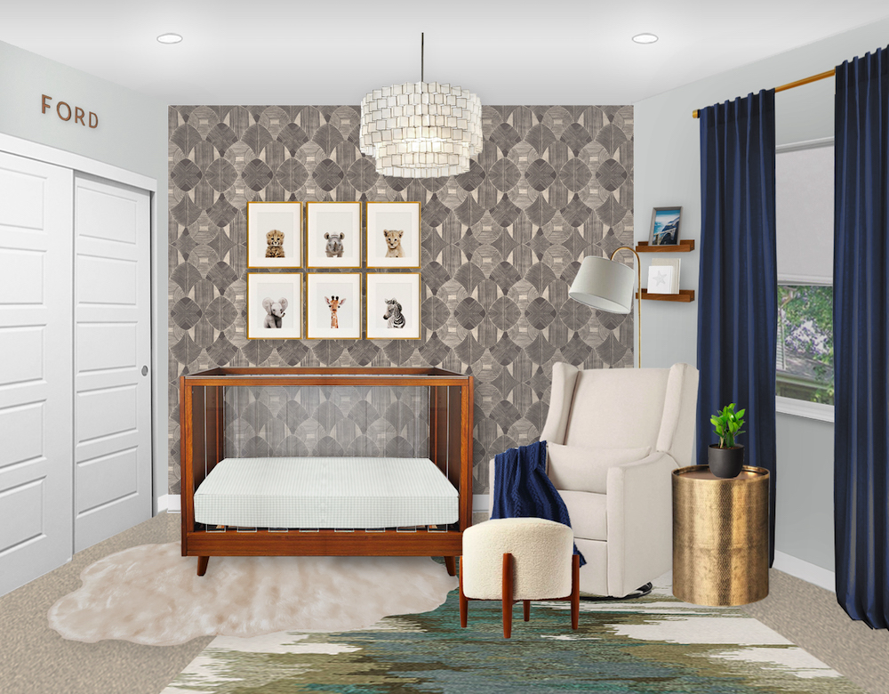
We’ve had a year full of E-Designs, and have another reveal ready for you! This client came to us loving some of the darker-toned rooms we have done in the past. The room they were using for their nursery was on the smaller side, so they wanted to balance the darker tones while being mindful of not overwhelming the small space. A statement wall with wallpaper was also a must, so we started looking for a fantastic print!

Wood Wall Name | Wood Acrylic Crib | Geometric Wallpaper | Animal Prints | Chandelier | Gold Floor Lamp | Wood Wall Ledges | Neutral Glider | Navy Blanket | Boucle Ottoman | Gold Round Side Table | Small Plant | Navy Blackout Curtains | Faux Sheepskin Rug (similar) | Green Abstract Area Rug
We chose this dark geometric wallpaper for the statement wall because it is neutral yet eye-catching. It’s bold and geometric, but not cold and modern. Also, with a lighter color as the background color of the print, we could add bold colors elsewhere without the room becoming too dark. We kept the walls a soft and soothing pale greenish gray, and added more pops with navy and warm wood tones.

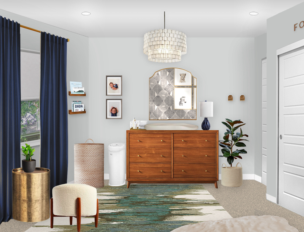
Navy Blackout Curtains | Small Plant | Round Gold Side Table | Boucle Ottoman | Woven Hamper | Wooden Wall Ledges | Gray Art Frames | Diaper Pail | Wood Changing Table | Gold Wall Mirror | Chandelier | Navy Table Lamp | Woven Planter | Faux Rubber Tree | Gold Wall Hooks | Green Abstract Area Rug
for the crib and changing table, we went with a midcentury modern style with warm wood. They create a light and dark contrast against the walls, making the crib pop off the wallpaper. Choosing gold as the metallic feature played well with the dark wood also. Gold accents were placed throughout the room to create a cohesive look.
Since the nursery was small, it was important to add a mirror over the changing table to help bounce the light around and open up the space. Adding a mirror opposite a wallpaper feature wall also reflects the pattern, so you can see it on either side of the room.
As is important in any nursery, the window treatments were a big consideration in this design. We went with navy blackout curtains so the room could be darkened when needed, and the navy adds a pop to the room. The rug has green tones in it so it didn’t end up being a navy-dominant room, and the gray in the rug also helps to balance the gray in the wallpaper.
· Nursery Details ·
Wood Wall Name | Wood Acrylic Crib | Geometric Wallpaper | Animal Prints | Chandelier | Gold Floor Lamp | Wood Wall Ledges | Neutral Glider | Navy Blanket | Boucle Ottoman | Gold Round Side Table | Small Plant | Navy Blackout Curtains | Faux Sheepskin Rug (similar) | Green Abstract Area Rug | Woven Hamper | Gray Art Frames | Diaper Pail | Gold Mirror | Navy Table Lamp | Woven Planter | Faux Rubber Tree | Gold Wall Hooks
We always design nurseries to grow with the baby. The foundational elements of this space are sophisticated and the furniture is good quality, so there won’t need to be any major changes for quite some time (aside from switching out the crib).
What do you think? Are you into the deeper tones or do you prefer light and bright?
*This post may contain affiliate links, but don’t worry, I only link items that I 100% recommend! You can view our Disclaimer here.

