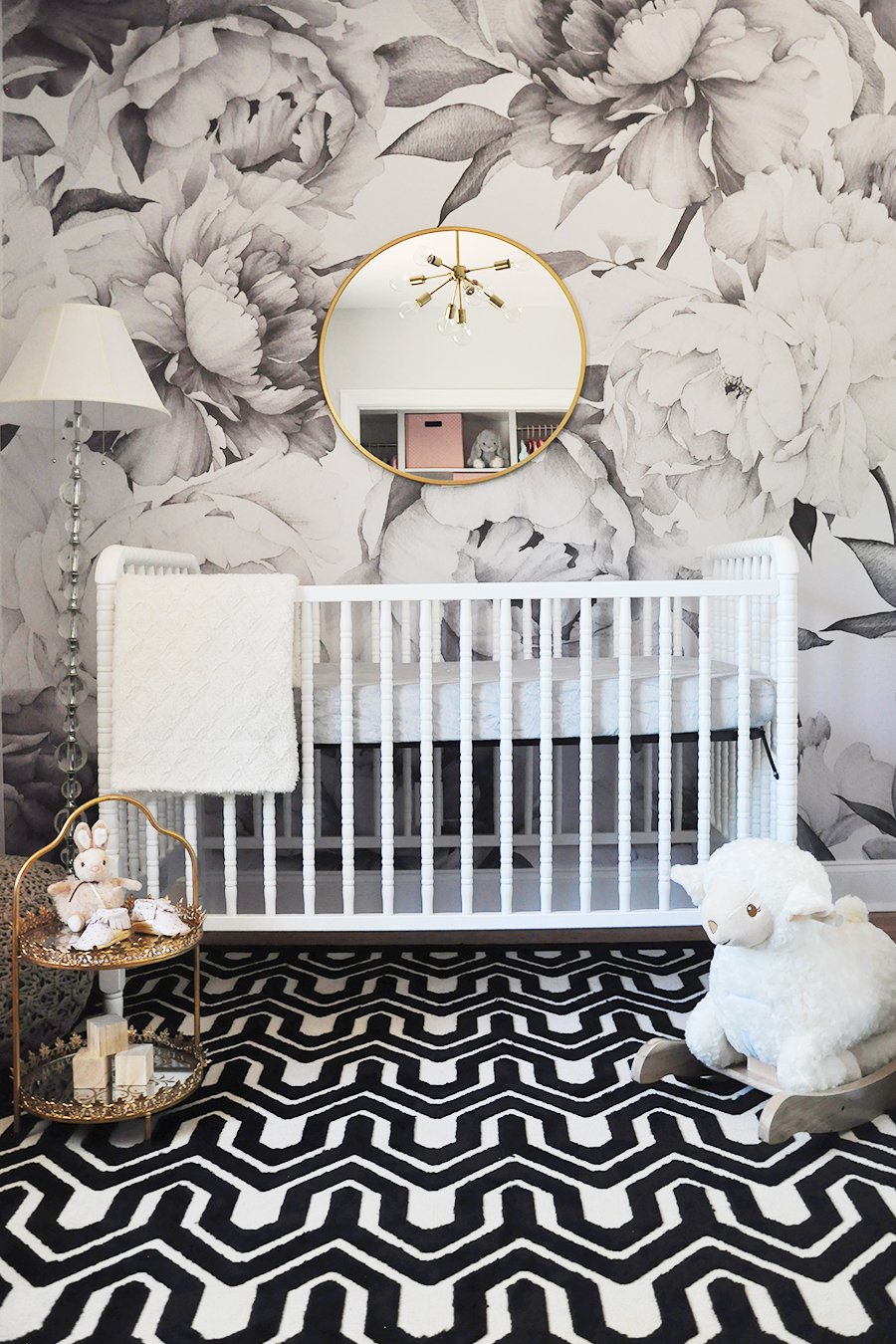
This past year, I have had a significant number of clients requesting nursery designs that are more gender neutral. In the past few months, I’ve gotten a slew a requests for gender neutral AND black and white nurseries. I’ve seen variations of this over the years, but it seems to be making a comeback in a different way now that gender neutral nurseries are so common. Typically, the nursery is a place to include more color and whimsy and to perhaps push the boundaries a bit more than in the other rooms of the home (like a client I had years back who’s home was all white, but the nursery was neon pink—why not?) So now that more neutral spaces are trending, black and white is an option that’s back on the table. Here’s how to pull this look off in your own space:
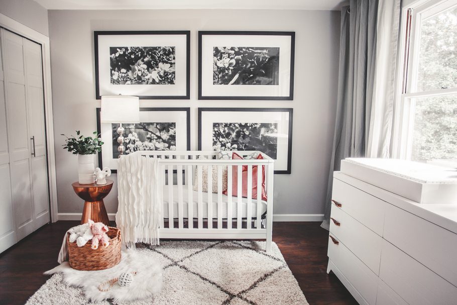 Nursery Design by Megan Burges Gilliam
Go Almost All-In for Monochromatic. One way to lessen the impact of a monochromatic scheme is to go for a base of black and white and then choose one or two subtle accent colors to break the scheme. This will help to lighten the look and will feel a bit less intimidating. Go for a pastel such as blush or mint to minimize contrast or try to work in light wood tones in place of an accent color. I loved the touch of copper in Megan Burges Gilliam’s design.
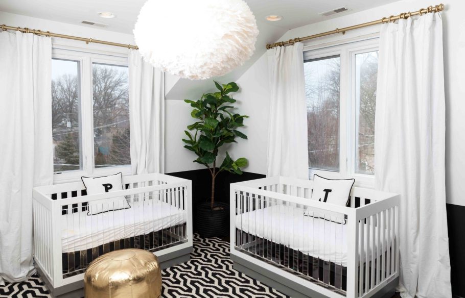 Gender Neutral Nursery for Twins
Don’t Assume a Style Framework When Designing in Monochrome. Often, many people only associate monochromatic with a modern or Scandinavian theme which could not be farther from the case! The biggest mistake is to assume there is only one way to pull off this look. The monochromatic scheme can work into absolutely any nursery style! Traditional, glam, industrial… you may have to alter the locations and uses of color, but the theme definitely holds!
Avoid the Extremes. Black and white doesn’t necessarily mean stark and high contrast. You can achieve the look while still creating a soft and cozy space. Avoid stark blocks of black and white (and I generally recommend against painting the walls black). Instead, incorporate transitional shades such a spectrum of grays to fill the gap.
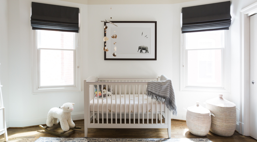 Nursery Design by Residents Understood
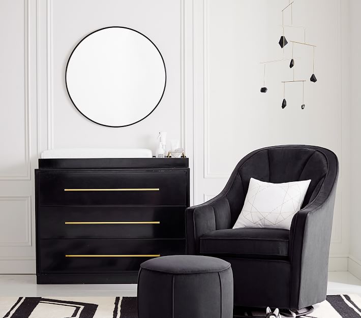 Lots of black and white nursery decor options from PB Modern Baby
Use Minimal Patterns to Avoid Contrast Overload. In a monochromatic look, the key source of contrast comes from the drastic differences in color. This contrast serves as the source of interest within the design. That said, the secondary elements should be toned down in order to respect this. Avoid overly bold patterns, textures, or finishes. This will only detract from the theme of the design and will overshadow the unity and flow. Instead, opt for more subtle patterns used in thoughtful locations.
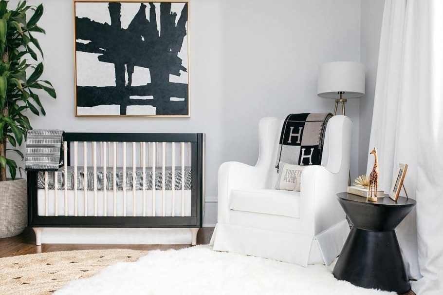 Emily Maynard’s Nursery by Oilo Studio
Start Off Small. You can be easily inspired by this trend without going all-in. Because black and white are neutral shades, this color combination can work into absolutely any space. Start by adding a few pieces here and there and work your way up. Incorporating monochromatic decor is a great solution for testing the waters.
With the popularity of this trend, stay tuned to see more monochromatic inspiration as well as the nursery e-designs I’ve been working on soon!
[et_bloom_inline optin_id=optin_10]

