Actress Elizabeth Tulloch and her husband, David Giuntoli, recently welcomed their baby girl! I had the pleasure of getting an up-close and personal glimpse into the nursery right from the start. I spoke with Elizabeth while she was still pregnant and starting to plan the nursery, and she had some amazing ideas.
Elizabeth and David’s home has elements of modern, vintage and mid-century. She wanted to bring that into the nursery as well and then sweeten it up a little with some blush pink accents (but not too many!).
 Elizabeth Tulloch’s Nursery, Photo by Bryan Geli
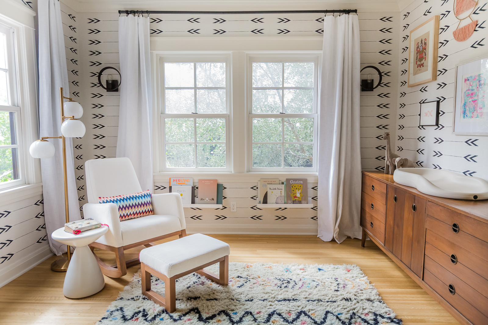
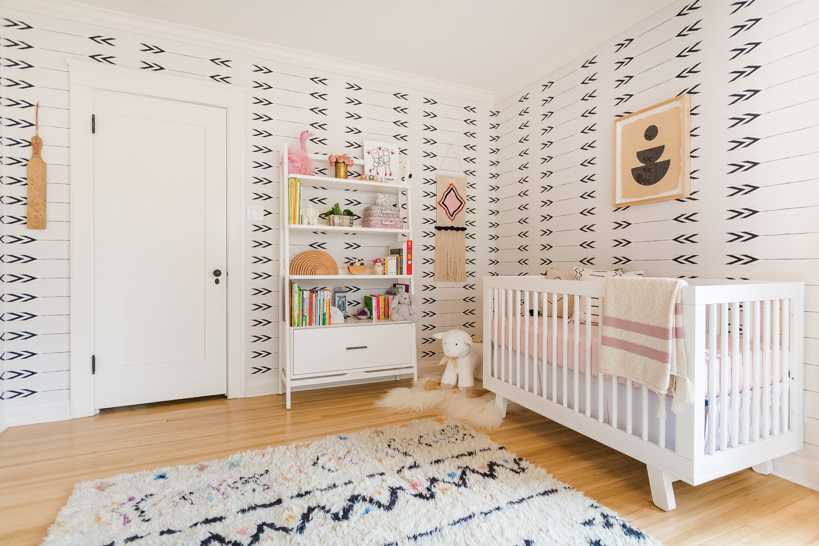
She knew right away that she wanted to use Cavern Home’s Tapestry wallpaper. It’s a high contrast pattern that makes a bold statement! When it came to furniture, she already owned a vintage mid-century modern piece that she repurposed as a changing table which really adds character and charm to the room. The rocker was an important piece, and Elizabeth really wanted something modern, comfortable and easy to clean. She chose the Monte Design Joya Rocker (my all-time favorite brand) and the matching ottoman. The walnut wood base on the pieces really brings out the wood tone of her dresser—not to mention the amazing Missoni print pillow!
 Elizabeth Tulloch’s Nursery, Photo by Bryan Geli
When it came to choosing all the registry items, baby gear and other must-haves, Elizabeth and David enlisted the help of Gugu Guru. I know Monica of Gugu Guru personally as well, and she really has created a genius service for all those burning registry questions.
 Elizabeth Tulloch’s Nursery, Photo by Bryan Geli
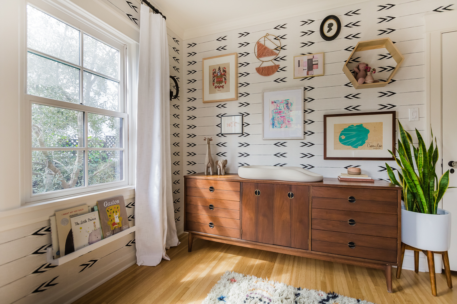
Just look at how cool that vintage dresser is! I love how she styled the gallery wall above it—even though it’s on top of the wallpaper, it’s not overwhelming. I love seeing eclectic and personal pieces in a nursery, and this is such a great way to display special items. See that little black silhouette at the top? That’s young David Giuntoli when he was four years old visiting Disneyland with his family.
 Elizabeth Tulloch’s Nursery, Photo by Bryan Geli
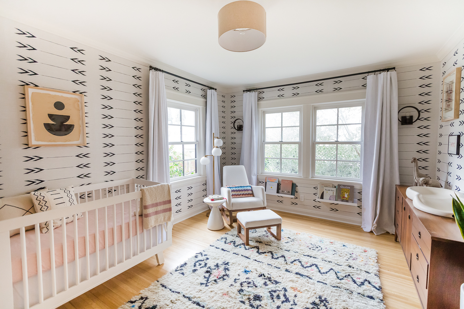
One thing that Elizabeth asked me about was how high to install the curtains. The curtains were originally hung right on the actual window molding (this is fairly common in homes of this style). I always suggest hanging curtains as high up as they go to make the room feel larger. It also helps keep any extra light out. It required some extra effort, but it really makes a difference in the space.
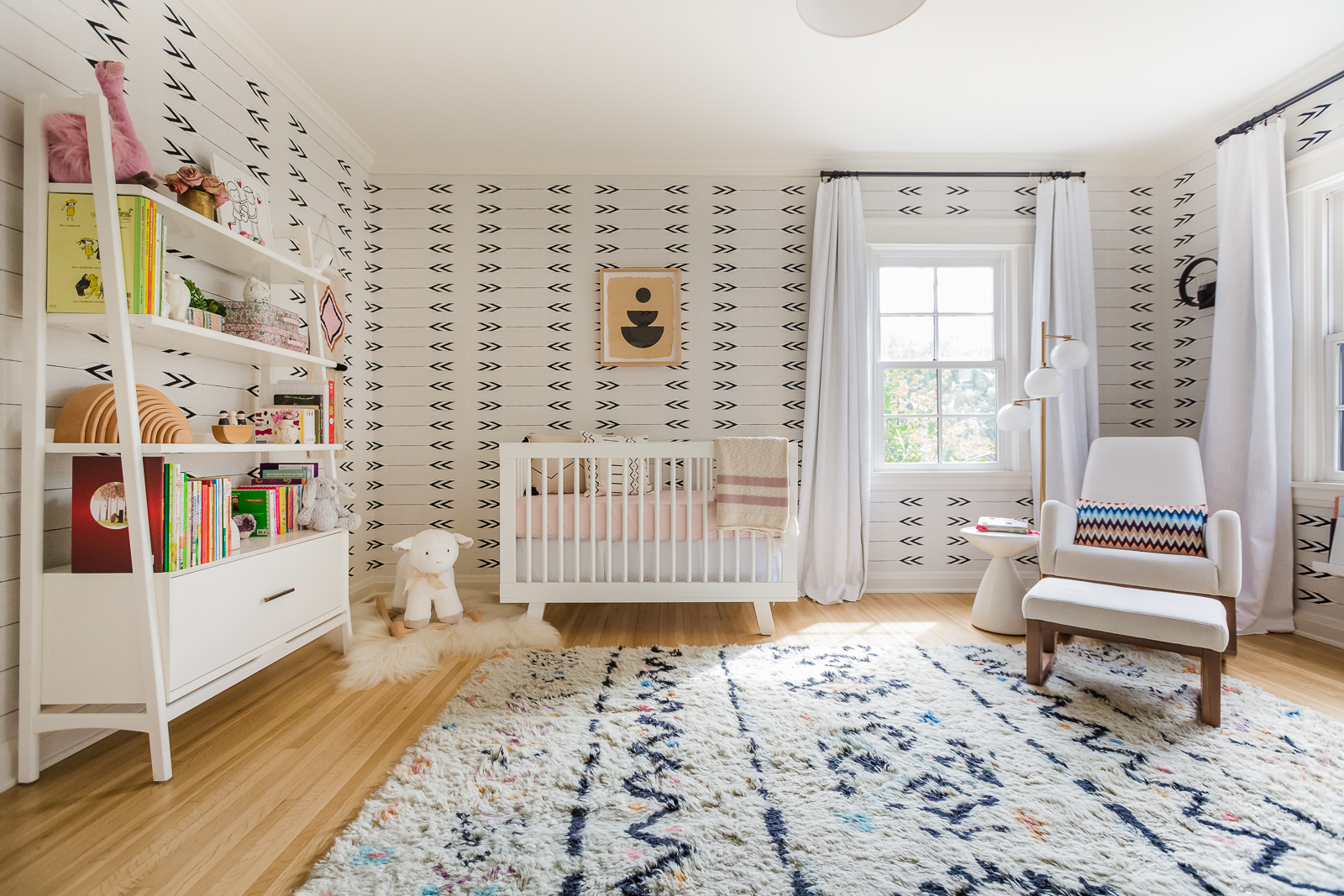 Elizabeth Tulloch’s Nursery, Photo by Bryan Geli
I love how many cute little touches Elizabeth put all around the space. Everything was intentional and thought-out, even down to the pretty crib blanket. I’m so happy for her and her newly expanded family and wish them a lifetime of memories in this special space!
Here’s a few more of the nursery sources:
Crib | Dresser (Vintage) | Tapestry Wallpaper | Joya Rocker | Striped Crib Blanket
[This article was originally posted on Project Nursery]
*This post contains affiliate links, but don’t worry, I only link products that I would 100% recommend!*
[et_bloom_inline optin_id=optin_10]
