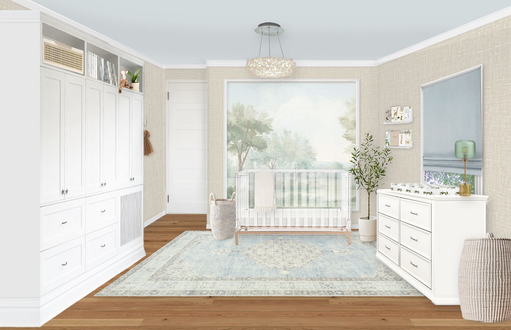
This nursery Virtual Design was a really interesting one! This home was historical and had a lot of very unique challenges. Our client wanted a nursery design that felt soft and serene with neutrals, blues and greens. She also wanted a wall treatment that had some interest and leaned toward tree patterns. This was one of the more difficult spaces we’ve designed in a while!

Nature Wallpaper | Neutral Textured Wallpaper | Acrylic Crib | Warm White Dresser | Green Table Lamp | Faux Olive Tree | White Book Ledges | Botanical Changing Pad Cover | Tall Open Hamper
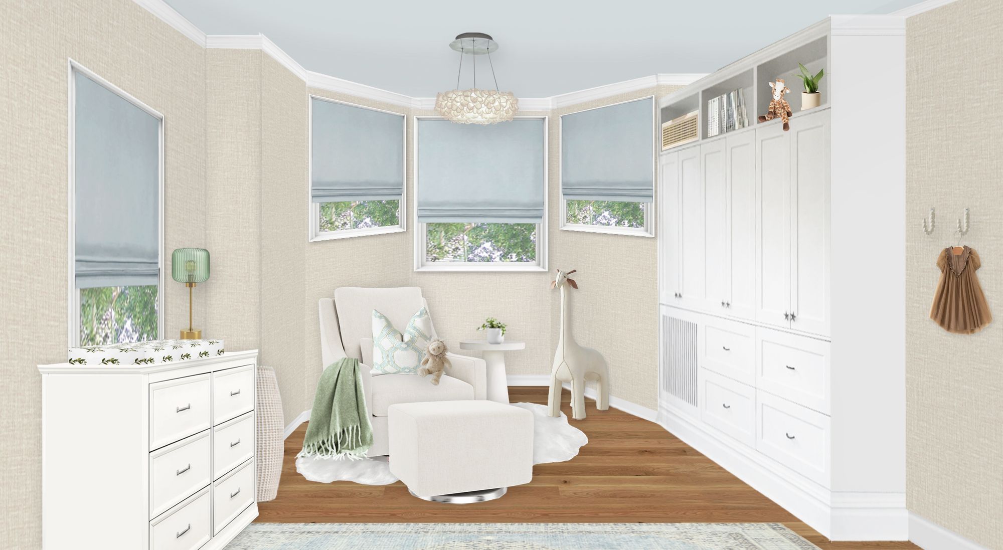
The floor plan was tricky as you can see in the renderings. There was a very large built-in cabinet which is great for storage, but it meant that we didn’t have that wall to use for furniture placement. Because of safety reasons, the crib had to go on the small wall with no windows. That meant that the dresser really had to go under the smaller window. It’s not ideal to have a dresser under a window, but it works in a pinch!
There was also a bay window on the other side of the nursery. This gave us a nice large area to put the glider and ottoman, which was nice. We also had a little space next to the built-in for some wall hooks, so overall the floor plan came together well.

Neutral Velvet Glider | Neutral Velvet Ottoman | White Pedestal Side Table | Faux Sheepskin Accent Rug | Patterned Throw Pillow | Large Plush Giraffe | Botanical Changing Pad Cover | Warm White Dresser | Green Table Lamp
As for the design of the nursery, we started by looking for a wallpaper. Because this room doesn’t have a great accent wall, we decided to frame in the wallpaper behind the crib. That way, the wallpaper wouldn’t have any strange edges and the molding actually works really well with this room.
Because this room is small and awkward, we chose an acrylic crib to help open up the space. We also didn’t have anywhere to put a mirror, so keeping the room feeling open was even more important. You can also see that the placement of the crib means that when you walk into the room, you see the side of the crib first. Having an acrylic crib lets you peek into it without having to turn the corner.
We chose a changing table that had a similar style to the built-in so it looked cohesive, and then added a few little colorful elements to dress it up. We kept the glider and ottoman neutral so the space still felt soft. For a little pop of color, we decided to go with light blue window treatments! We love how this nursery design came together despite its challenges.
Want your own nursery Virtual Design? Take a look at our design services page—we do book up quickly!
*This post may contain affiliate links, but don’t worry, I only link items that I 100% recommend! You can view our Disclaimer here.

