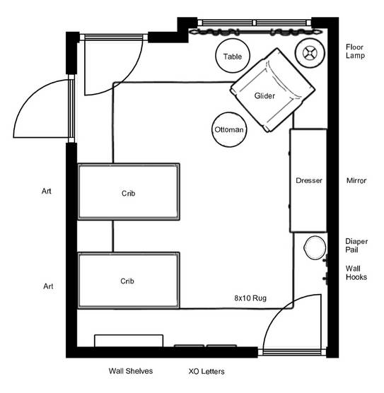
It’s time for another Virtual Design reveal! Our calendar has been absolutely full for the entire year, so lots of virtual designs have been in the works. This was a special design because it was for twins! It’s not easy to fit two cribs in a nursery since the nursery is typically the smallest room in the house, but we did it! Luckily this room was bit larger than average, and we were able to fit the cribs by turning them sideways.

So as you can see, we were just able to fit both cribs in! So, since you see the ends of the cribs when you walk into the room, we decided to go with a crib that had acrylic sides to help open up the room (and so you can see the babies from the doorway). The exact crib we used in the design below is unfortunately discounted now, but this acrylic crib is similar.

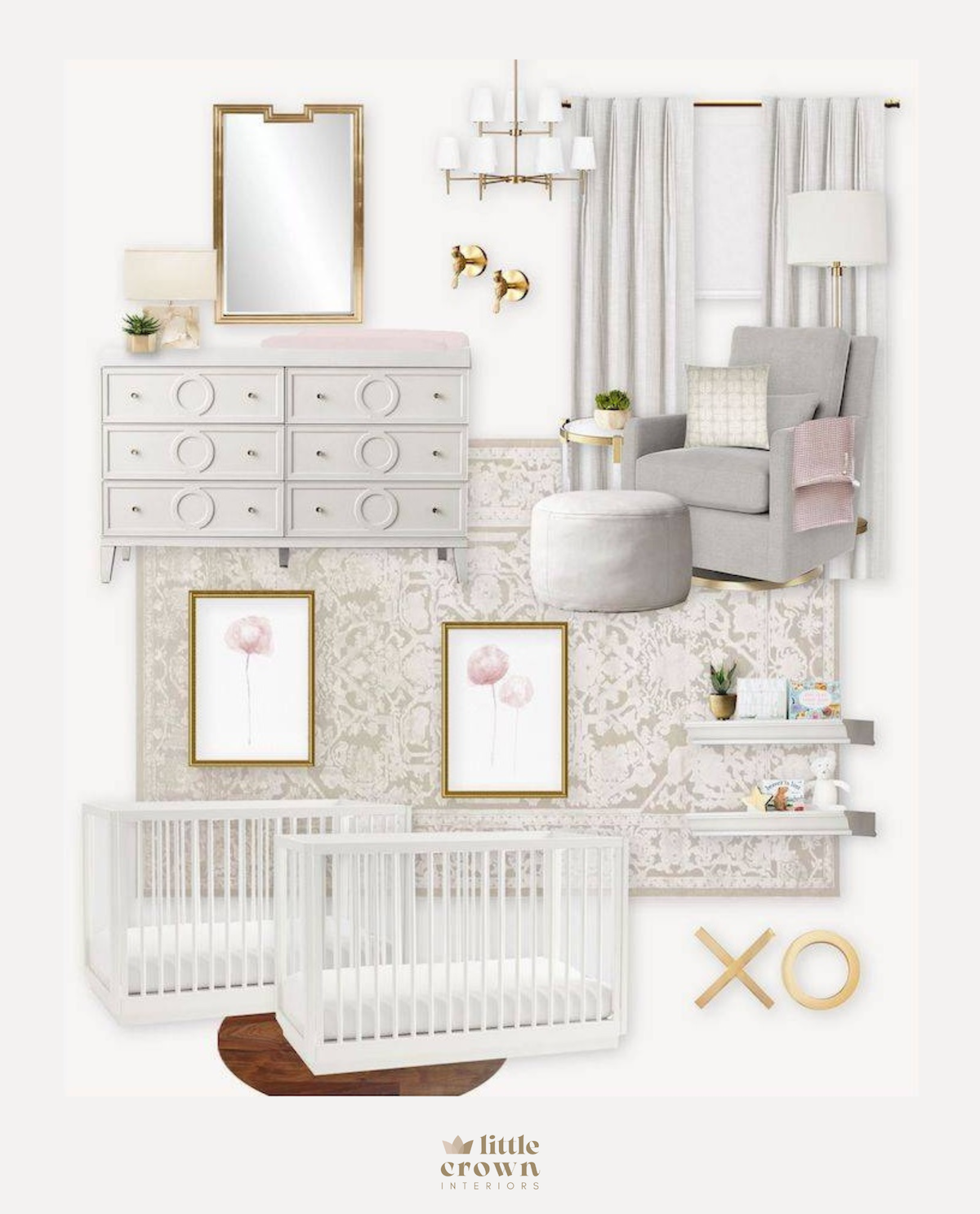
Crib (similar) | Dresser | Glider | Ottoman | Wall Ledges | Side Table | Floor Lamp | Mirror | Gold XO Art | Crib Art | Window Treatments | Window Hardware | Wall Hooks | Rug | Glider Pillow | Crib Sheet | Throw Blanket
We kept most of the nursery design soft and neutral, and then added in elements of blush and gold throughout the room. The rug is another favorite of mine! It’s so pretty in person, and the large pattern helps to conceal stains (it’s also really soft).
We finished off the room with lots of decor and accessories, like the more traditional style curtains, wall ledges, soft blush floral art and gold wall mirror. My favorite part of this room is actually something you can’t see from the virtual design board. The room has a high ceiling with a soffit, so we painted the inset of the ceiling a super soft blush color. The rest of the walls are a very pretty neutral so the pink ceiling really stands out! The large white and gold chandelier also looks amazing!
*This post may contain affiliate links, but don’t worry, I only link items that I 100% recommend! You can view our Disclaimer here.

