A few weeks ago on Instagram, I shared an image of a nursery design I’ve been working on for a client in Los Angeles. When I first met with her, she knew she wanted some safari elements in the room, possibly in a wallpaper design.
Safari nurseries have been a huge trend for such a long time, but even within the safari theme, things have changed a bit over the years. I used to get requests for a more traditional safari look, with lots of earthy tones, browns and greens. Nowadays, people are opting for a much more sophisticated look in the nursery. I can’t even tell you how many clients have been asking for neutral colors, monochromatic looks and even all white or all ivory.
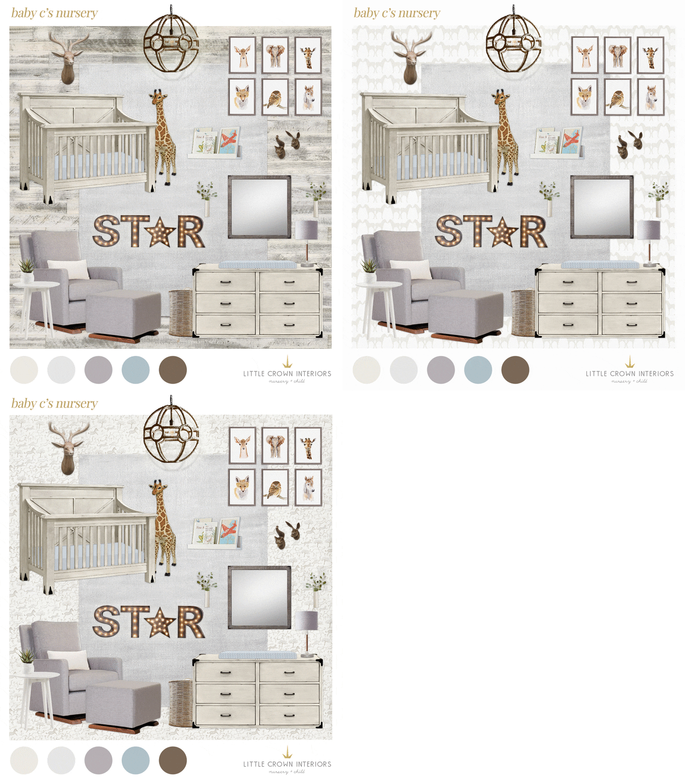
So, back to my client. When I went back for her first design meeting, I brought a few fun safari theme wallpapers for her to choose from (as well as a rustic wood paneling look as an alternative).
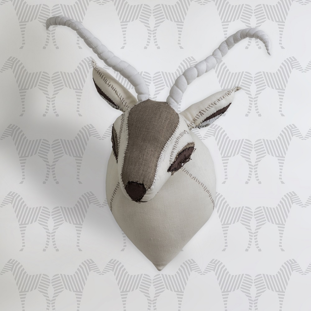
Option 1: Zebra print wallpaper from Sissy + Marley. I just love the geometric lines of this one. The other great thing about it is that the color of the zebras is fairly subtle, which means it wouldn’t be overwhelming on all four walls of the nursery (which we wanted to do).
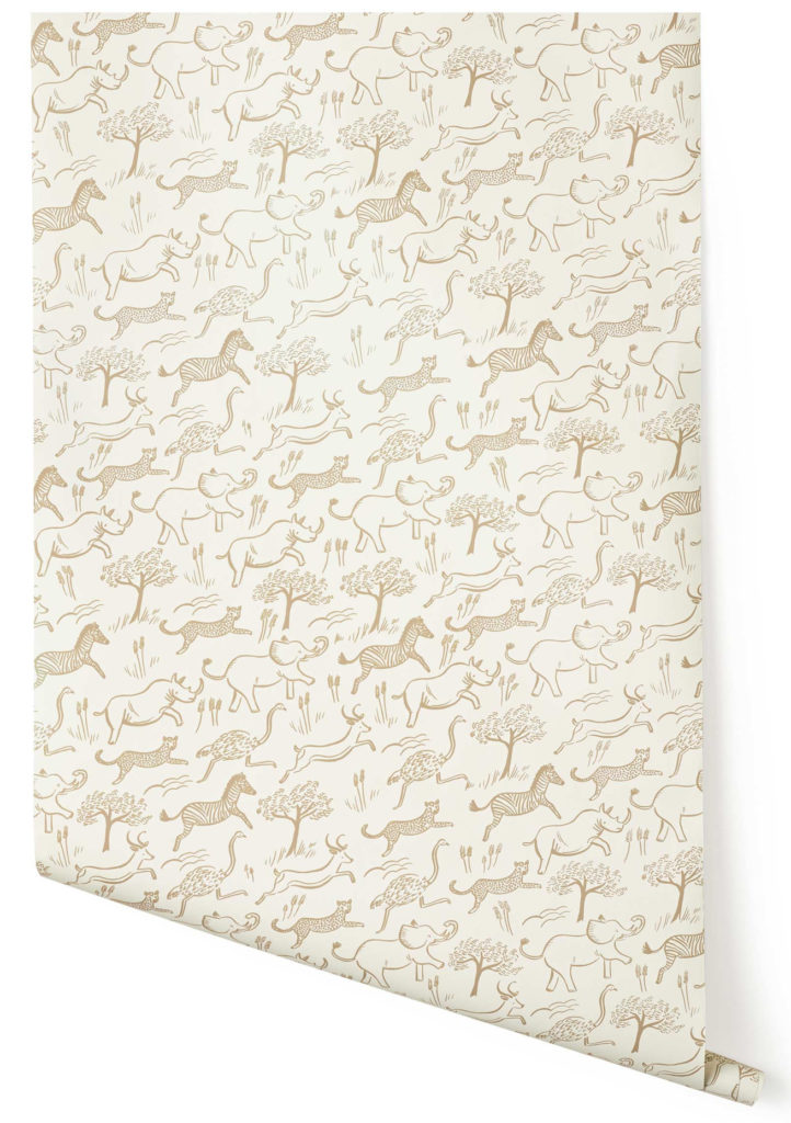
Option 2: Rifle Paper Co. Safari Wallpaper from Hygge & West. This pattern was definitely at the top of my list. I love how the style of the drawing has whimsy and because the animals are on a slight diagonal, it really gives them movement. And again, the colors are subtle, so it wouldn’t be overwhelming in the space.
Option 3: Ark wallpaper by Andrew Martin. This was the very first safari wallpaper I showed her, even before we had our first design meeting. It has a more traditional look and has a soft hand-painted feel, which I love. It’s a bolder color in a darker grey, but still neutral enough to use on all four walls.
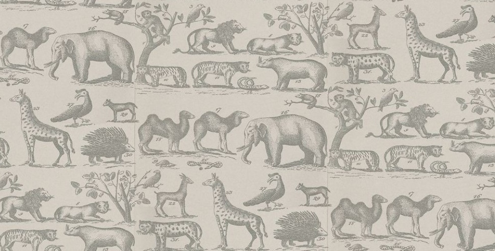
Option 4: Spot wallpaper from Abnormals Anonymous. I love this wallpaper, but I wasn’t sure about it for this particular space because it’s fairly high contrast and the base color is slightly more yellow.
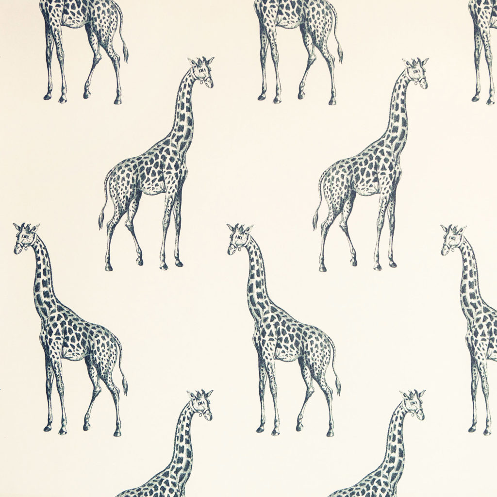
And the winner is…Option 3! We decided to go with the Andrew Martin wallpaper because it just has such a beautiful sophisticated look and will give the space longevity. However, we did end up going with a different color that’s a little lighter and more on the beige side. Stay tuned for updates on this neutral safari nursery!
[This piece was adapted from my original post for Project Nursery]
[et_bloom_inline optin_id=optin_10]
