With the start of the new year comes Pantone’s announcement of their color of the year. This new shade will make its way through the fashion, manufacturing and, of course, the interior design industry. This year’s color, Classic Blue, is a bright and cheery blue hue with a subtle teal undertone. We can all be inspired by this color in one way on another weather it be a full room of paint, a bright blue chair or a decorative accent.
Although royal blue is typically associated with boys’ rooms and nurseries, I like to try to bridge the gender gap. Blue is one of the best colors to use in any space because it pairs so well with almost any other hue. This color also plays well with other neutrals, wood tones, and metallics. I’ve put together some of my favorite Classic Blue pieces below.
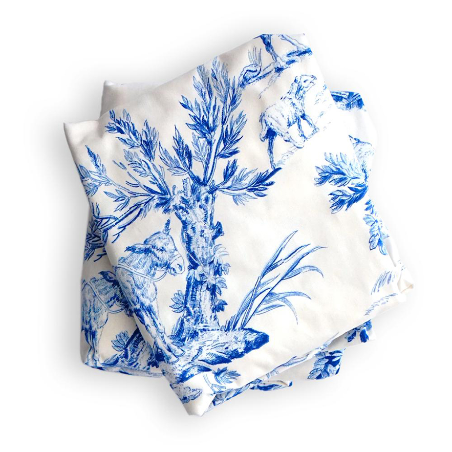
This gorgeous toile pattern is actually a crib sheet! There is something about the combination of a bold color mixed with a statement pattern that I am always drawn to. I included this toile crib sheet as an example of how blue can be easily used within nurseries for either gender. The delicate toile pattern adds a feminine edge and can be played up or down depending on how much color you want to use within the design. Plus, the subtle play on chinoiserie is stunning!
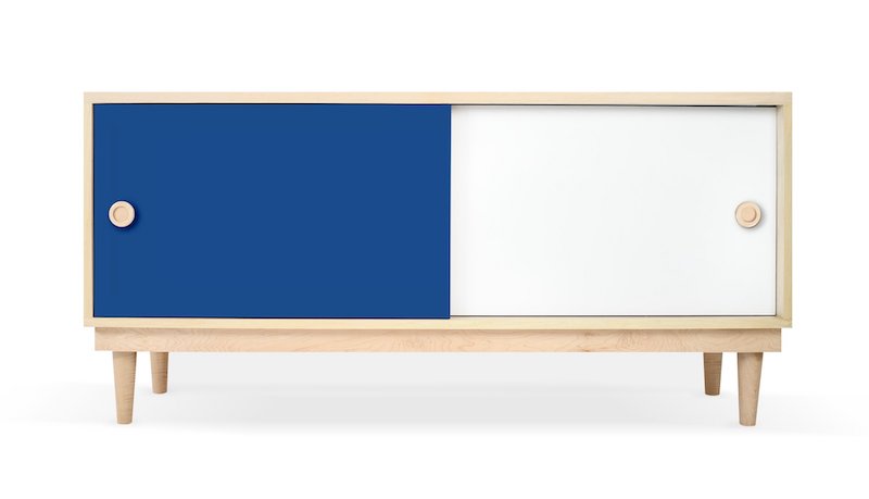
Kid’s room and playroom storage is always a tricky thing to find. Options are generally limited, especially for fun colors. That’s why I love Nico & Yeye’s Lukka Console so much. It’s totally customizable and comes in lots of bright colors and wood tones to match your decor (including, of course, blue)!

Wall mirrors are pretty much an essential in nursery design. I always suggest them to clients as a piece to go over the dresser or changing table because they help bounce light around the room. Wall mirrors also help a small room feel larger, especially is there is a lack of natural light. This blue wall mirror is such a fun design, and the color is sure to bring some life into a space!
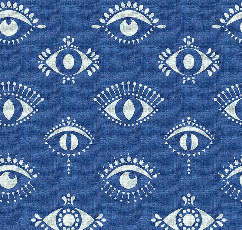
If you’ve followed me or read my blog, you’ll know that I’m a wallpaper junkie. This evil eye pattern in cobalt blue is so great, and I definitely want it for many rooms in my house. I love the quirky design and rich bold color.
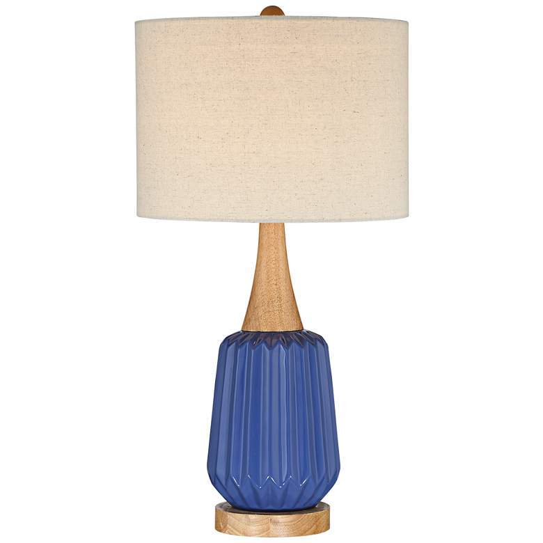
I actually just used this blue Mid-Century lamp in a boy’s nursery E-Design, so it was fresh in my mind. I love the combination of wood and ceramic, and how it has such a classic Mid Century shape.
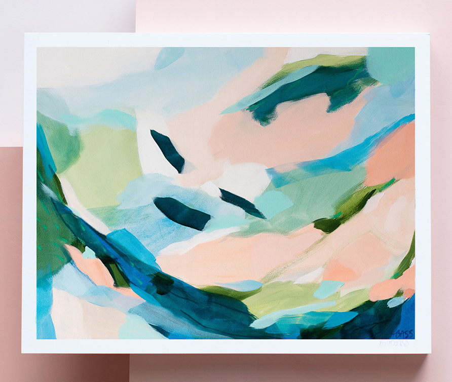
Keep in mind that you don’t have to go overboard in order to be inspired by a color or trend. Take as much or as little from the trend that you feel comfortable with! This print by Britt Bass is the perfect example of how you can draw just enough inspiration to inspire something greater!
*This post contains affiliate links, but don’t worry, I only link products that I would 100% recommend!*
[et_bloom_inline optin_id=optin_10]
