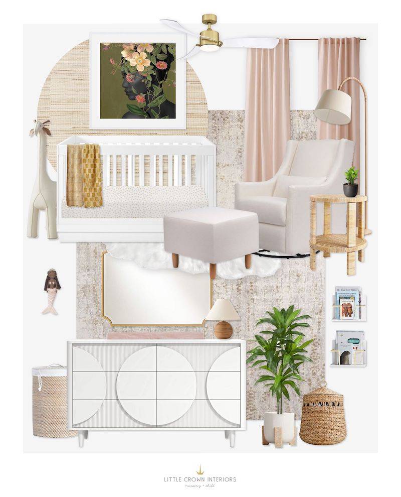
Softness and texture are two design elements that have been super popular lately, and for good reason. Texture adds interest and warmth while softness adds coziness and a safe feeling that so many people want for their nursery.
This E-Design client sent in her inspiration photos and there was a lot of texture along with a clean transitional design. She also mentioned that she wanted a space with a big, bold piece of artwork to really stand out, along with some little fun modern touches. As for the color scheme, she wanted something with neutrals and some pops of blush and green.

· Nursery Details ·
Acrylic Crib | White Dresser | Neutral Glider & Ottoman | Grass Cloth Wallpaper | Gold Mirror | Side Table | Rug | Gold Ceiling Fan | Floor Lamp | Hamper | Statement Art | Wall Shelves | Storage Bin | Faux Sheepskin Rug (similar) | Table Lamp | Velvet Curtains | Large Faux Plant | White Planter | Throw Blanket | Large Giraffe | Mermaid Doll | Crib Sheet | Small Plant
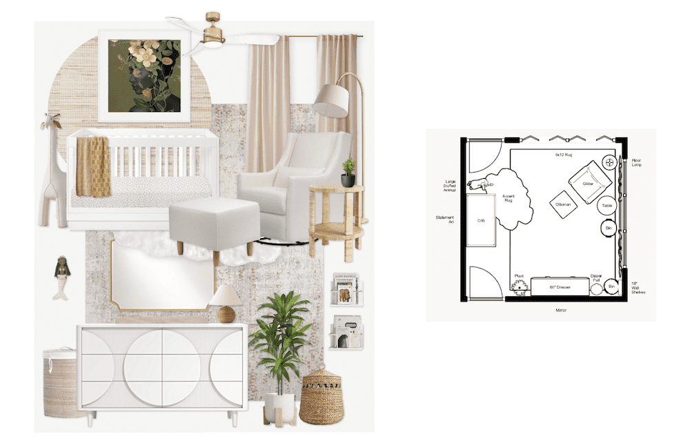
To bring in those modern accents, we started with a white acrylic crib and white dresser with a fun circle shape accent. The floor plan in this nursery worked out so that when you walk into the room, you see the side of the crib. Having acrylic sides not only looks great, but also makes it easier to see into the crib from the hallway at that angle.

As you can see in the floor plan above, there is a closet with bi-fold doors at the top, so we needed to place the glider a little bit away from that in order to have access to those doors. Luckily there was room to do that! So there is a nice seating area with the neutral glider, ottoman and side table, along with a storage bin for toys.
Since this room was on the larger side, we were able to get a 9×12 rug in here. It’s pushed up against the right side of the room so it doesn’t get stuck under the door swings. Then to balance it on the crib wall, we added a washable faux sheepskin accent rug (one of my all-time favorite nursery additions).
The main piece of decor in this nursery is, of course, the amazing statement wall art. It’s a large piece and we suggested to the client to have it framed in plexiglass (no real glass above the crib) and secure the heck out of it. The client is located in a state that doesn’t have earthquakes, but it’s still always a good idea to heavily secure anything going over the crib. To top off the design, we added some gold accents like the ceiling fan, floor lamp and mirror above the changing table.
Want a nursery E-Design of your own? Check out our E-Design page for all the details. We do book up in advance!
*This post may contain affiliate links, but don’t worry, I only link items that I 100% recommend! You can view our Disclaimer here.

