This nursery E-Design is a fun one! This client came to us knowing some of the fundamental pieces she wanted in the room and was solid on her style and the elements she wanted to see. Overall she wanted a unique, traditional look focusing on timeless classic pieces. She wanted the nursery to feel cozy and transitional—something their family could enjoy for years to come. She wanted a lot of whites and neutrals, and touch of grayish blue with gold accents. You know we love gold accents!
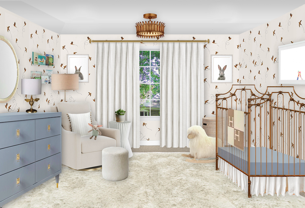
Bone Mirror | Gray Blue Dresser | Gold Bee Lamp | Acrylic Book Ledges | White Floor Lamp | Ivory Velvet Glider | Striped Pillow | Sheepskin Ottoman | Fluted Side Table | Ivory Blackout Curtains | Gold Chandelier | Sparrow Wallpaper | Bunny Art | Woven Bin | Sheep Rocker | Ice Cream Art Print | Gold Iron Crib | Blue Crib Sheet | Crib Skirt | White Shag Rug
As always, we started with the floor plan, which was pretty straight forward in this room. The space was on the smaller side, as many nurseries are, but we still had room for everything we needed. We chose the rug and drapery in larger sizes so they would help open up the room. Another easy way to do that is by placing a mirror over the dresser, which we did!
Since this client wanted wallpaper, we chose a really fun pattern that’s whimsical, but also neutral and won’t overwhelm the space. This wallpaper has been on our list for years, and it was exciting to finally be able to use it in a nursery!
Since the room is small and the crib is positioned so the side is visible from the hallway, we knew that an open-feel crib would be great for this space. That way, she can see into the crib from the hallway, and the crib doesn’t take up too much “visual space” in the room. We went for a deep gold on the crib, a bolder gray blue on the dresser, and neutral on pretty much everything else.
The shag rug, fluted side table, and the extra texture in the bone mirror really bring some dimension to the space. For window treatments, we decided to go custom, thus bringing more of that traditional look in with the pleating. And of course, they curtains are blackout.
As a request of the client, we wanted to try to incorporate one of Max Wanger’s pieces. This simple yet perfect nursery print of the ice cream cones feels modern and sweet. For the other pieces, we wanted to keep things neutral yet stay away from bohemian or abstract prints since she mentioned she didn’t love those.
Our last little design addition was a gorgeous fluffy sheep rocker tucked next to the crib. We love that a little element like this can grow with the baby. If you didn’t already see, we have a roundup blog dedicated just to the sheep trend. If you love this one, make sure you go and check out more of what we love!
· Nursery Details ·
Bone Mirror | Gray Blue Dresser | Gold Bee Lamp | Acrylic Book Ledges | White Floor Lamp | Ivory Velvet Glider | Striped Pillow | Sheepskin Ottoman | Fluted Side Table | Ivory Blackout Curtains | Gold Chandelier | Sparrow Wallpaper | Bunny Art | Woven Bin | Sheep Rocker | Ice Cream Art Print | Gold Iron Crib | Blue Crib Sheet | Crib Skirt | White Shag Rug
We had such a blast creating this room—we love it when we can help a client’s vision can come to life. Looking for your own nursery E-Design? Make an inquiry now—our calendar books up in advance!
*This post may contain affiliate links, but don’t worry, I only link items that I 100% recommend! You can view our Disclaimer here.
