Is there’s one thing we get asked about all the time, it’s what paint colors we use our nursery designs. We’re ready to share the exact paint colors we used in the nurseries below, which are some of the ones we get asked about the most! Paint is always very difficult to choose because there are literally endless options, and they can look very different once they are up on the walls.
Before we get started, there is one very important note about paint colors—they always look different in photographs! The main suggestion we always have is to sample the actual paint on your actual walls first! Even painting a sample on a piece of wood or paper will look different. Your room, your lighting, other colors you may already have in the space—all of these things will affect how a paint color looks in your nursery (or any room).
 Dunn Edwards Soft Mauve Windmill
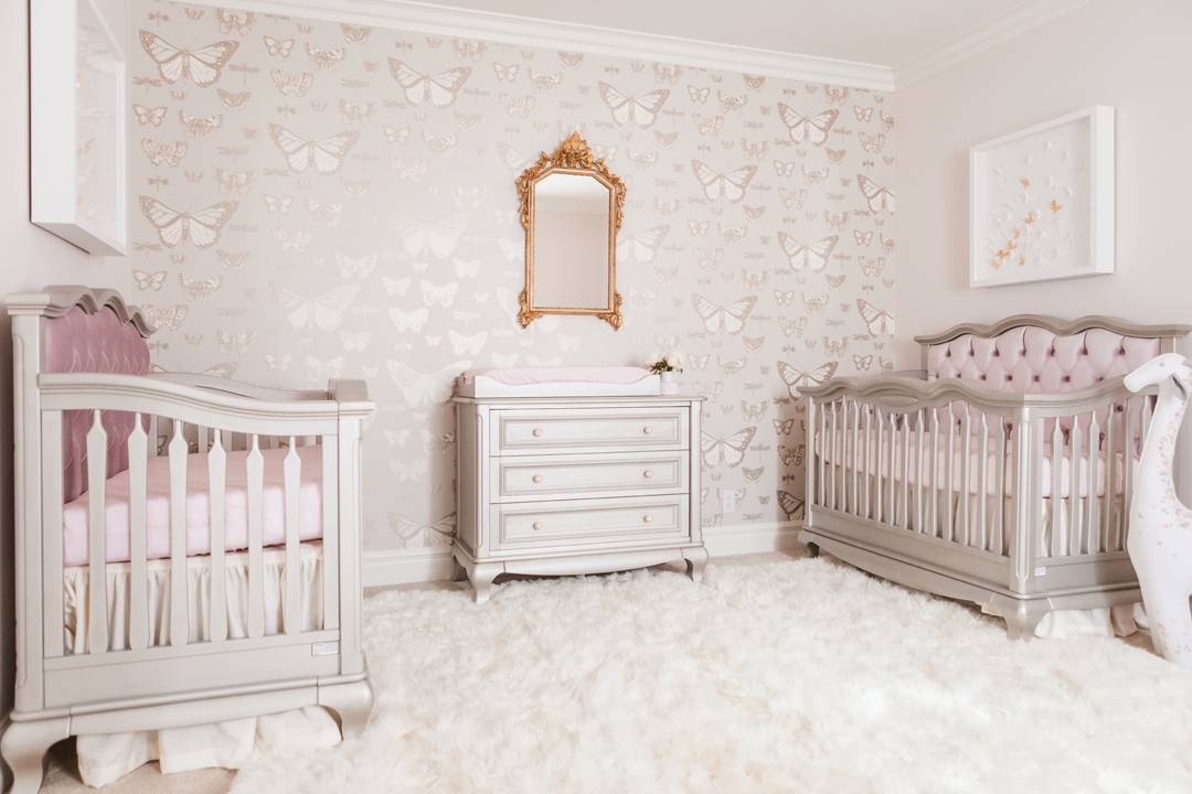
For this Butterfly Twin Nursery above, we wanted a wall color that would match the soft and sophisticated feel of the nursery, and that coordinated well with the butterfly wallpaper. We chose a super subtle mauve/blush color and it is incredible in person! It’s very light with a cool undertone, so it works well with the cooler pinks and the grays from the wallpaper and the furniture.
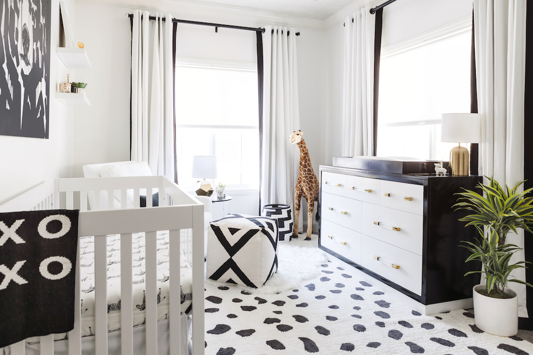
We get asked A LOT about what the best white paint is. In this modern and crisp black and white nursery we opted for a clean pure white with no undertones to really highlight the high contrast design. This room is also small, so having a bright crisp white didn’t feel harsh or overwhelming.
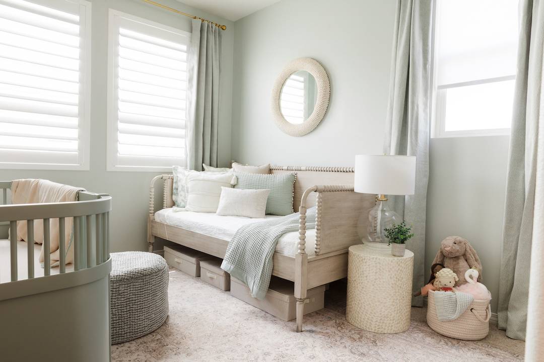
This southern inspired nursery had a range of gorgeous colors to pull from since there is a gorgeous wall mural on the opposite wall. We really wanted this room to feel serene and calm, so we used a soft gray with muted minty green undertones. The subtle greenish gray walls and the charming mint green crib have a great tone on tone feel. Here’s a designer tip: Don’t always trust the name of a paint color! Even though this color is called Arctic Gray, it’s very minty green in person. Another reason why it’s always best to sample first!
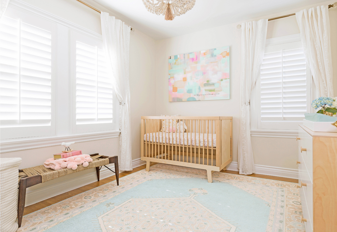
Finding the perfect neutral wall color is not easy, especially because undertones can always be an issue. This particular color is a great neutral paint that doesn’t have any yellow or green undertones. In this neutral pastel nursery, the soft creamy parchment-like tone creates a nice calm background for the pastel palette.
 Benjamin Moore Chantilly Lace by Benjamin Moore
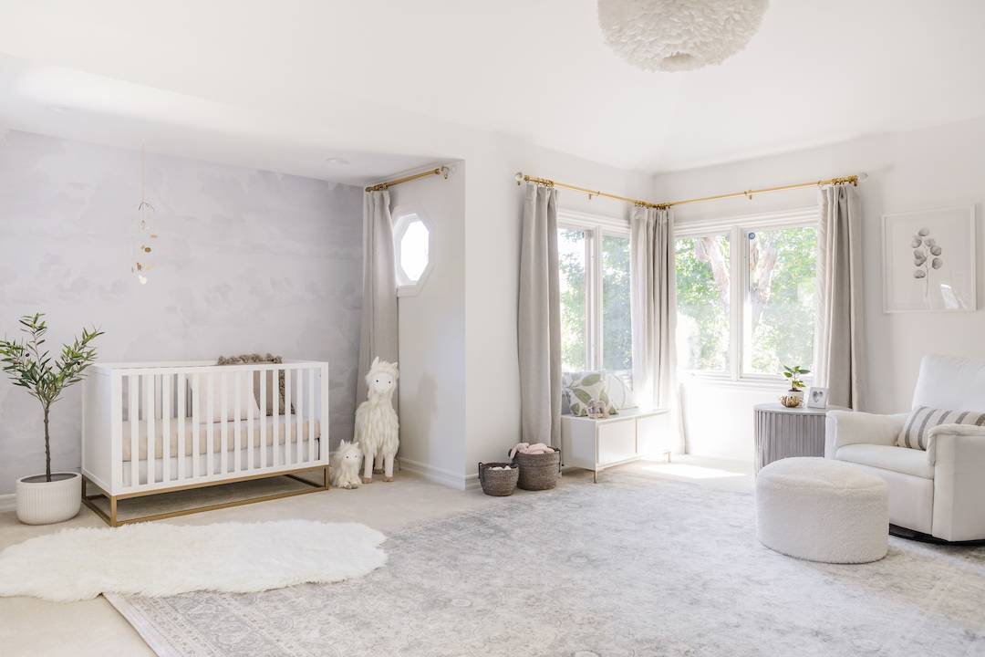
If I had to choose my favorite white, this would probably be it! Chantilly Lave is a super clean white with the tiniest hint of softness, so it doesn’t look harsh or stark. I love the way it looks in this gray and neutral nursery with the subtle gray cloud wall paper.
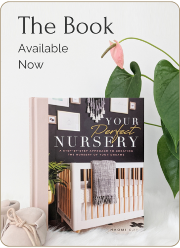
If you have read my book, Your Perfect Nursery, you probably know about the “empty room syndrome” that can happen right after you see your freshly painted space. Sometimes the color you so carefully chose all of the sudden seems completely overwhelming. The empty room looks entirely too pink or too green or too bold. This is totally normal! Once you get your furniture, decor, drapery and lighting in place, the paint color will recede and it will feel much more balanced.
Also, when you browse paint colors, don’t forget to consider the natural light in your space and size of your room. Choose a zero or low VOC formula, but still make sure you have plenty of time to properly air out the space before you start using it.